Where do we get fresh color inspiration in a world full of color rules?
Below: my favorite color.
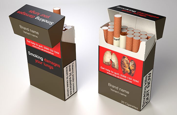
It’s widely considered the ugliest color in the world. So ugly, it’s used on cigarette packaging alongside photos of diseased lungs to deter people from purchasing as part of anti-smoking health initiatives in Australia, Ireland, and the UK. Here’s a mockup.
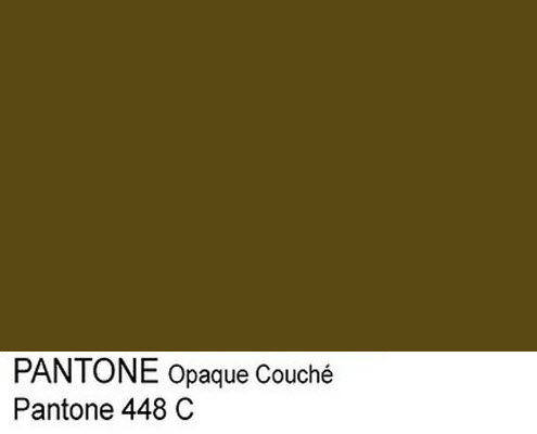
But context is everything when it comes to color. This round-up of photographs shows opaque couché in a wide variety of beautiful manifestations – from foliage to sky, smoke and streetlamps. It has a warm, golden tone that feels firelit and mysterious. Even ancient.

While I worked in a yarn store, I heard a lot of people’s ideas about colors and what they mean. What colors are happy, what colors are age-appropriate? Color seasons were frequently discussed, and I always had trouble answering when asked if a color matched someone’s skin tone. Who am I to say what looks good with someone’s skin, especially if the color brings them joy, and especially when people with darker skin tones have historically been discouraged from wearing certain colors? I am a white person who has never been othered by my complexion.
My very least favorite customer interaction at the yarn store went like this:
The customer was looking for yarn for a sweater she planned to work on and wear during a trip to Europe and asked for my help. We picked out two colors, one of which I loved, but I admit is challenging. I had used it myself in a sweater project and was so excited that another person liked it. It was a speckly mix of light gray, gunmetal, neon yellow-green, and loam brown. Challenging, right, but interesting. She left happy and excited for this project. But she called the next day asking if she could return the yarn. Why? She said her husband didn’t like the color.
There was a lot of this: the idea of what will be the most beautiful. Most beautiful to the people who will see it, most beautiful in the landscape of the existing wardrobe. But beautiful didn’t mean beautiful, it meant easy and non-confrontational. This understanding of beauty is alienating to me. But if I grate so much against beauty, then why am I so afraid to be ugly?
I don’t want to define beauty as the things that are easy to look at, or necessarily attractive. I want to define beautiful here in this blog post as interesting, and that includes things that are ugly and disturbing.
So let’s look at some colors and find interesting, ugly, and disturbing ways to look at them.
Like many knitters, crocheters, artists, crafters, I love looking to natural phenomenon for inspiration. Like bruises.
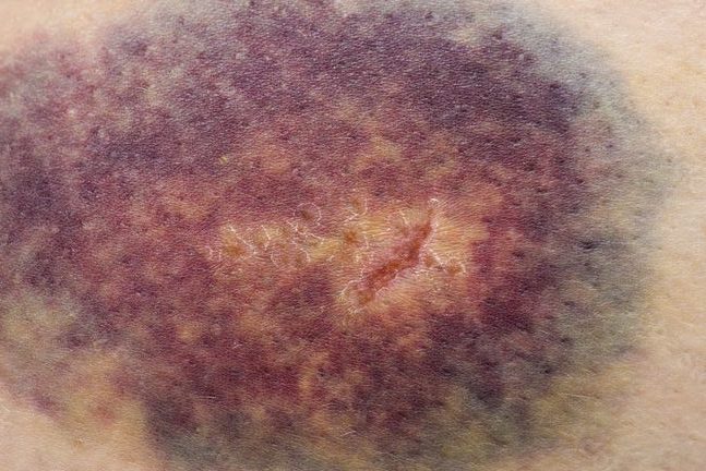
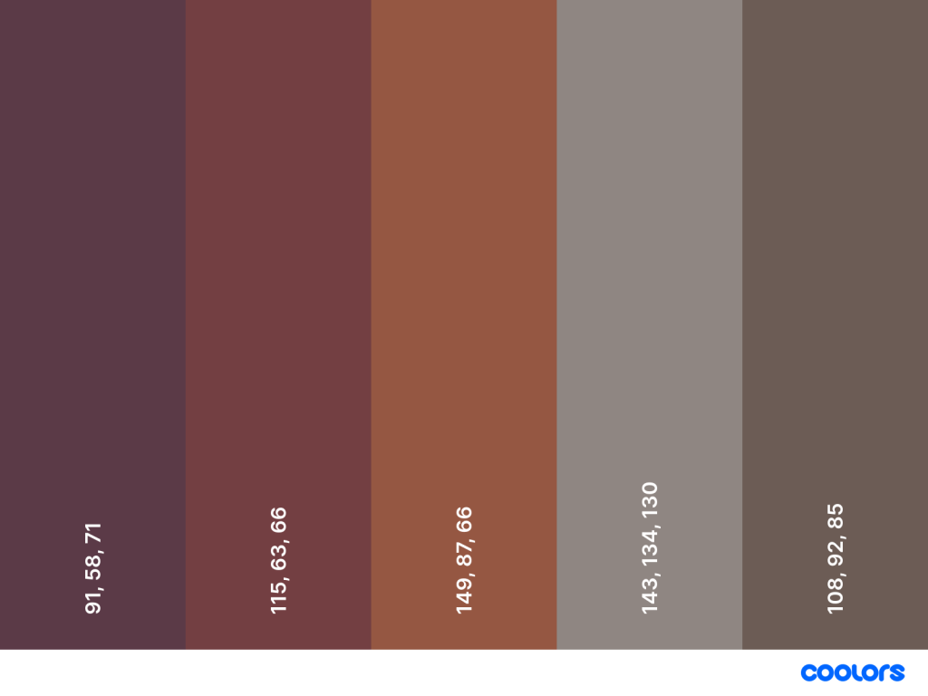
Gross, right? Painful-looking? Sure, but the colors are spectacular. I’ve recently realized that many of my favorite colors -berry red, warm purple, olive green, and opaque couché – all appear in bruises.
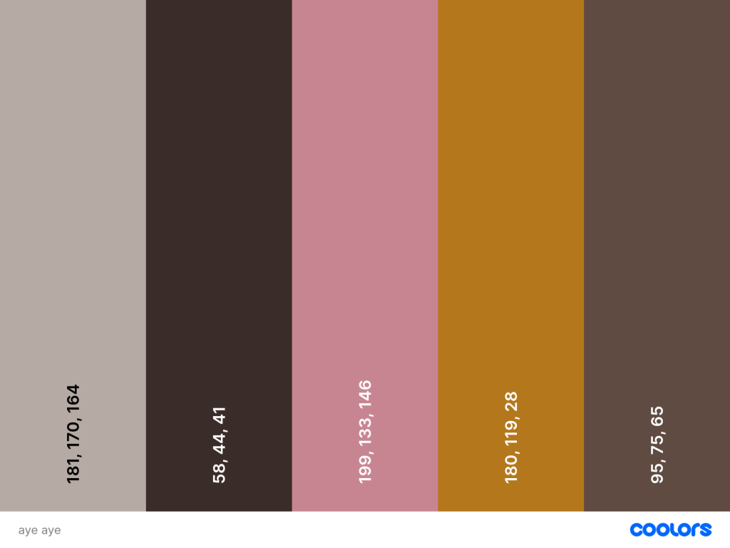
Let’s look away from brightness and saturation. Isn’t nature full of animals that survive by camouflaging into leaf litter, soil, and darkness? I know I’ve sold the calm, neutral palette of the aye-aye in yarn to at least one customer. And look at that bright pop of amber in its eyes!

I’m getting a little biased toward earth tones, so let’s go back to something more vivid for inspiration. Like the bearded vulture.
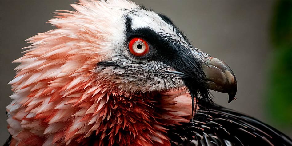
Check out at those striking red eyes and feminine, peachy-pink feathers! These carrion birds eat everything, including the bones. We stan a sustainable queen.
But these are all examples of me finding some beauty in conventionally ugly vessels, so let’s find some ugly in a conventionally pleasant vessel. Like my neighborhood on this very sunny, mild spring afternoon. What do I get when I pick out some colors from this photo?
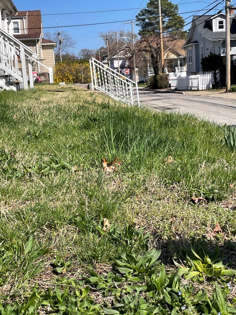

To keep it fair, I only picked colors out of this photo from organic matter – I left out any human-made objects. I also tried not to replicate shades of the same color. From right to left, I picked some periwinkle flowers growing on the lawn, the bark of a magnolia tree, a forsythia bush down the block, the grass, and the sky.
And this is a challenging palette for me. Everything feels very weak. The blue and purple are too cool to harmonize with the yellow and green, and maybe this purple and blue are too similar to be distinguishable. The tree trunk is undefinable as a shade. Is it brown or gray? What color are trees, even?
I feel the urge to adjust some of these colors. Maybe the three in the middle need to be pushed cooler to create a pastel palette. Maybe the two on the ends and the tree need to be more saturated and warm to get something 70s-chic. Maybe everything just needs a good punching-up. I will try to resist that urge.
But it’s interesting that despite being given very real colors (albeit diminished by my phone camera, and diminished again by the display on your screen, and diminished again by being stripped of texture and depth by the handy color palette tool I used) I still feel like they could be tweaked. These weak colors are confronting me.
When I draw color inspiration for my knits, or if I were to try rendering something in paint, am I trying to correct them in real life? Would a painter disregard a subject because its disharmony would be mistaken for the artists’ inability to render harmonious color?
I can’t help but think of my partner, who sometimes does freelance color grading and correction for digital footage. He manipulates the color on screen, which is processed as data from a compressed linear format that appears flat and gray, to an end product that matches his client’s aesthetic goals. Sometimes that goal is more artistic, especially if he’s working on footage for a narrative film and there’s a genre-dictated mood to achieve; sometimes it’s corporate and the client wants something that feels bright and neutral; sometimes the goal is to recreate, as realistically as possible, what the people on set were seeing, even if my partner was never on set himself. Plus, even before he gets to color correction, the realism is tampered with on set. Things are lit in a certain temperature. Makeup, which is its own color and light correction, is applied to anyone in frame. The make and model of the camera and the settings on the monitors will all affect how the color is processed into data. There are so many thumbs on the scale.
Even the goal of realism isn’t really to be real – he told me about a time he was working on footage for a beauty product line whose branding was all about “natural beauty”, but he was told to reduce the overt redness in one model’s skin. That was too natural, apparently, to be beautiful. While red and pink are widely enjoyed as decontextualized colors, on skin they signify imperfection and blemish. Even infection and illness, even though these too, are natural occurrences.
And so it was at the yarn store. Not even just suggesting a color palette that was a little strange, but even mentioning unpleasant or indelicate personal associations was enough to turn people off a skein and stop asking for my help shopping. Someone would be holding a lovely pink yarn and I’d bite my tongue about how it reminded me of flayed muscle, because they were probably thinking about azaleas . I said once that a steely blue-gray reminded me of sharks and that was enough to shatter their dreams of chic, neutral baby blanket for a little boy. My coworkers were glad to come up with unhinged color schemes and inspirations but when it came to selling the yarn, it was rare that somebody could match our freak. So the same color combos kept walking out the door, and wilder, louder, uglier-but-more-interesting colors were neglected.
And maybe this was because I was working in the midst of a great beige trend in knitwear marketing. It’s understandable; beige, tan, taupe, sand, gray and white are neutrals and so the allow the actual design of the knitwear to be the first thing you see. They’re the lorem ipsum of colors.
And I’m not a neutral hater! I’m wearing black 95% of the time. There’s a long history of knits that are neutral by design, namely Aran sweaters and Shetland lacework that are traditionally made with undyed wool, and therefore show off extremely intricate details. Plus, we have the agency to knit these things in whatever colors we want. But what makes neutrals so safe is that they never feel like a mistake. They’re never challenging to the eye. Neutrals have been branded as “classy” and I…am not that.
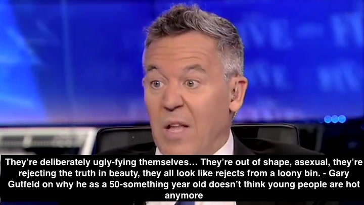
So here’s my recommitment to getting ugly and garish. I’ll wear and knit with whatever gives me the most joy, especially if it washes me out or clashes with my undertone. I will cherish the colors that are most maligned and roll around in them like the little piglet I am. I will not be a spring, summer, autumn, or winter, but a horrible fifth thing. And I’ll wake up every day and think of how I can make this guy angry.

Leave a comment