Author: Common Pipistrelle

  • FO Friday: The Junco Sweater

    FO Friday: The Junco Sweater

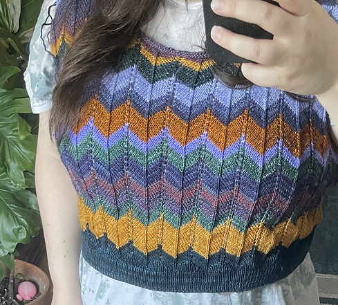
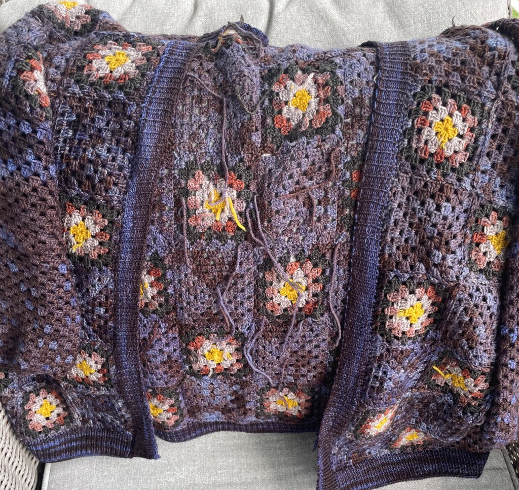
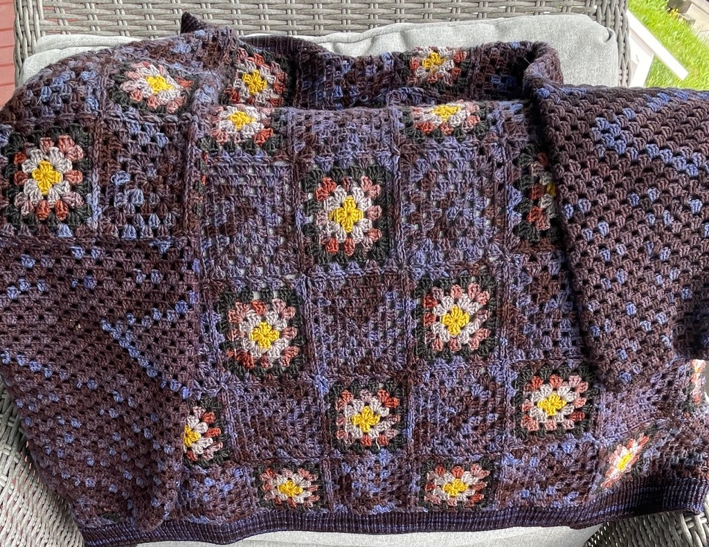
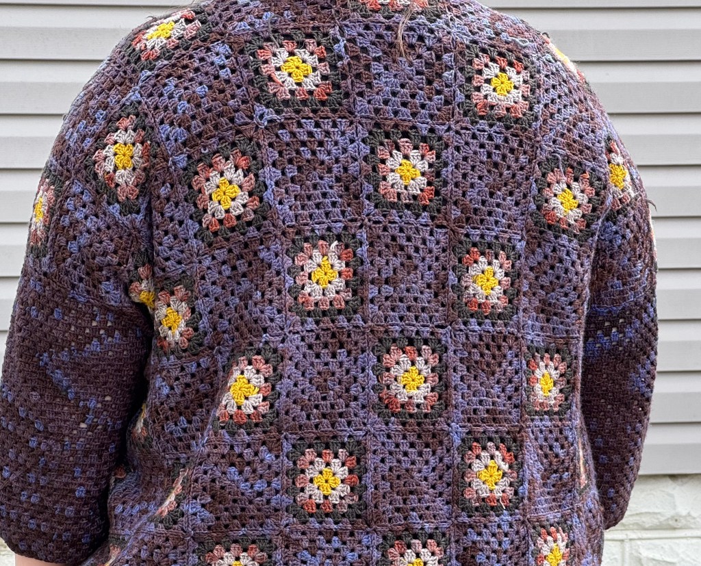
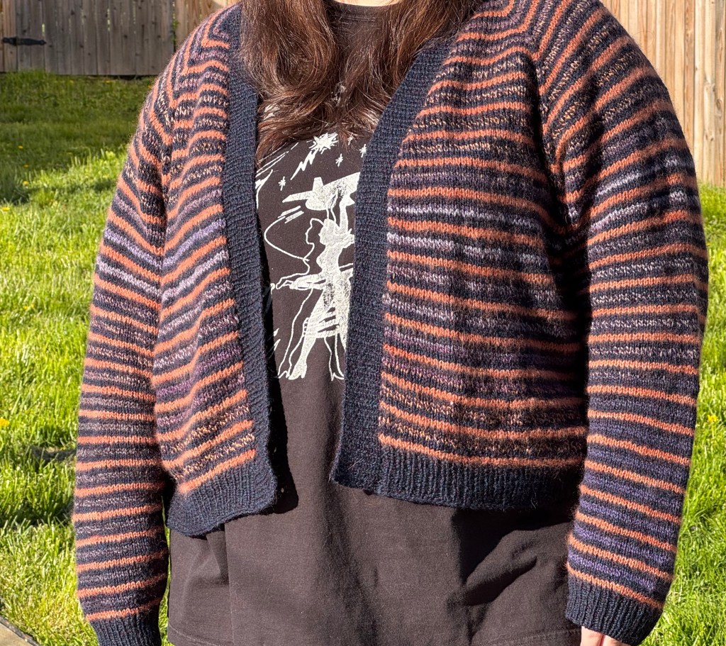
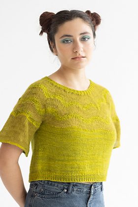
    I’ve talked about my appreciation for Junction Fiber Mill on here before, and specifically their colorway “Constellation”. I picked up a sweater quantity with no plan during the Maryland Sheep & Wool Festival in 2024, but when I returned to their booth last weekend I was proud to show them what I had made with it: Andrea Gaughan’s Junco Sweater.

    I was first turned onto Andrea Gaughan from knitwear designer Ellen Coy of Knithow, who is a knit-fit expert and part of a network of designers committed to size and shape-inclusivity. While I was going through Andrea’s portfolio, Junco’s diamond mosaic motif popped out to me immediately. Particularly because the sample in her pattern photos was in black and white natural wool, I was reminded of harlequins.

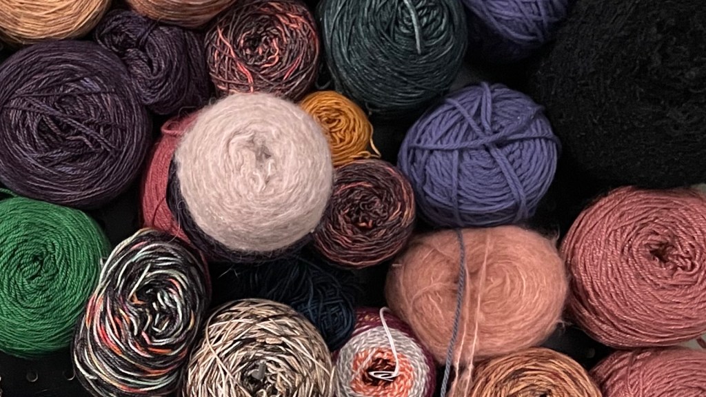
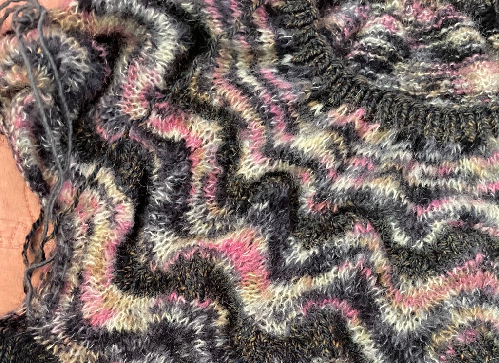
    As striking as the monochrome was, I knew my DK-weight from Junction Fiber was perfect for this project. While mostly purple and gray, “Constellation” has some splashes of ochre and orange, so I wanted to find a rich, warm earth tone to pair with it. I found that at Rhinebeck later in the year from Fiber MacGyver, who was a new vendor at the 2024 festival; their color “Roasted Pecan” was a great complement.

    Some wound up cakes of “Constellation” and “Roasted Pecan” sit next to my work-in-progress on Junco

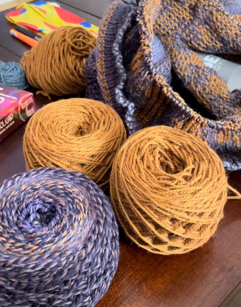
    I also adore mosaic knitting; while I want to improve my skill at stranded colorwork, it’s just so nice (and gentler on my knuckles) to only be managing one yarn at a time. Mosaic knitting shows off fractal-spun yarns like Making Tracks so well, and there’s a pixelated, 8-bit charm to the motifs this style creates; I appreciate the juxtaposition between my digital association with mosaic knitting and the millenia-old tile art that it’s named for.

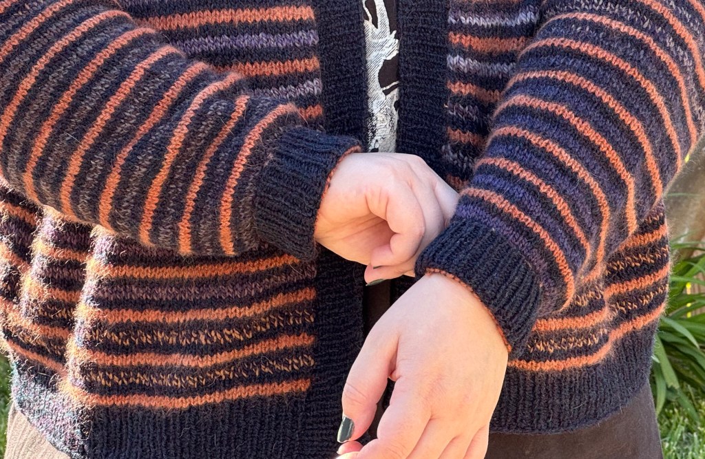
    For this project I sized up because I wanted this sweater to be roomy. As I have a 48″ bust circumference, this meant a big investment in the amount of yarn I was using and the time it would take. I also knew I wanted to add length to the body so the sweater would at least hit my hips. This bottom-up design uses an tubular long-tail cast-on for the hem and sleeves, and unfortunately my tension for this part was kind of loose, resulting in a flared silhouette. Instead of redoing it all, I sewed some elastic thread into the wrong side of the hem and sleeve cuffs, which both neatened up my ribbing and provided a stretchy edge, so I can it wear down at my hips or tuck it up under itself at my waist for a cropped look.

    I’ve knit bottom-up patterns before, but this was the first raglan I knit bottom-up instead of top-down. At first I wondered what the benefit was, but I have to say it was nice getting the sleeves done before the yoke. It really felt like I was approaching a finish line when I was casting off the collar, with the rounds getting shorter and shorter as I went.

    A photo of an unfinished knitted sweater sleeve made with multicolor purple yarn and brown yarn. The pattern is a diamond motif, and as the sleeve increases in size, more diamonds are added and appear to "burst" from the origin point where the increases occur in a symmetrical pattern.
    A close-up of the sleeve in progress. I think the increases look particularly cool.

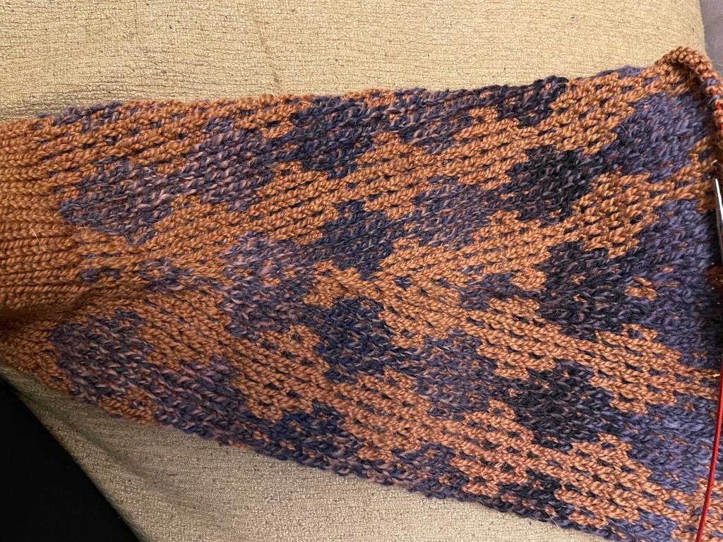
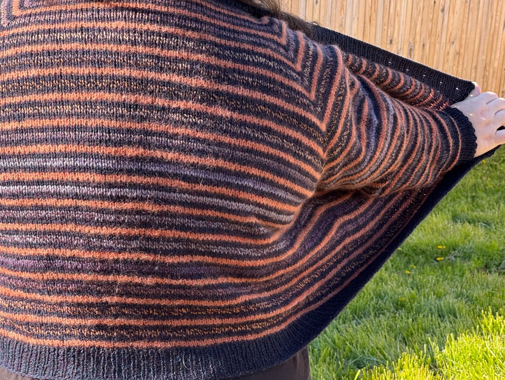
    From cast-on to blocking, Junco took me about 6 weeks to finish. The way the motif creeps from the increases of the sleeves and disappears again into the raglan decreases in the shoulders is psychedelically eye-catching, as is the shifting of colors in the yarn. I really couldn’t be happier, and I think it’s one of the projects I’m most proud of.

    Apologies for the awkward/poorly-lit photos. My partner usually photographs my modeled pics and he’s out of town, so I had to take selfies.
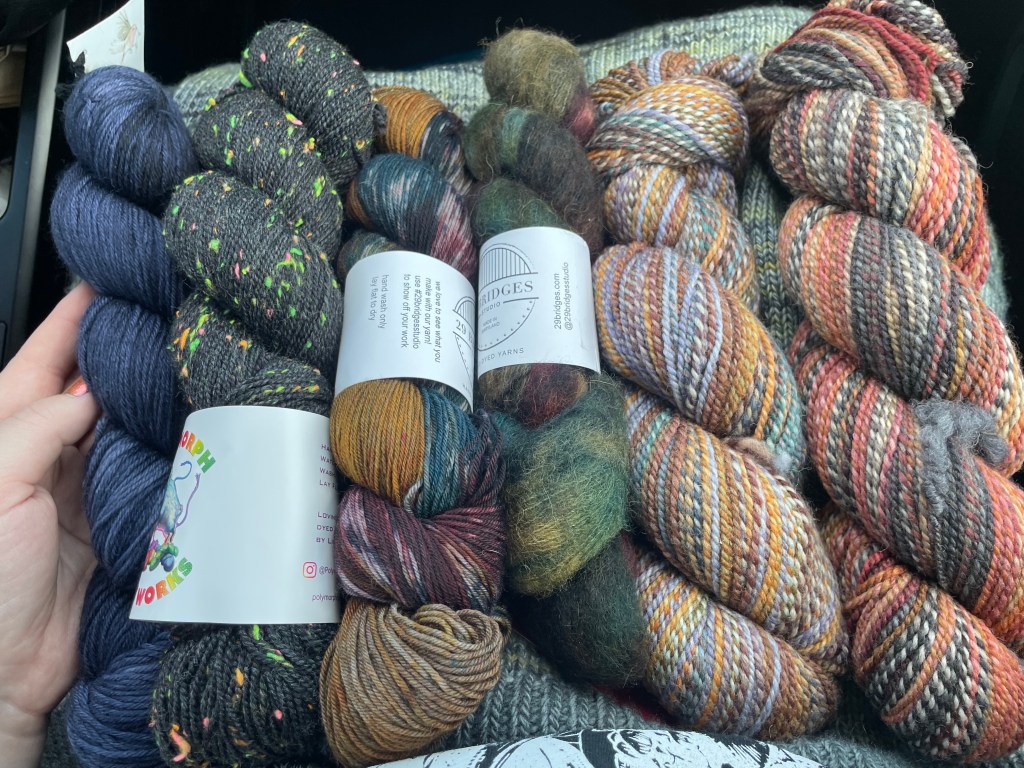
    Yarn

    • Junction Fiber Mill, Making Tracks in “Constellation” (MC); I used the leftover yarn in my Bookkeeper Cardigan
    • Fiber MacGyver, Merino Alpaca in “Roasted Pecan” (CC)

    Mods

    • Added 3 repetitions of the chart to the body
    • Sewed elastic thread into the hem and sleeve cuffs for fit and stretch
    • Did a flat collar instead of a folded collar

    What I’m Watching

    *CW: I discuss medical procedural shows in this section, and they deal with plotlines involving overdose and addiction, suicide, gun violence, and transphobia.

    I binged The Pitt in a day and loved it. The performances from the entire ensemble were outstanding, and I’m not surprised Noah Lyle is getting Emmy buzz. Because the season takes place over the course of a single ER shift, there’s an equally compelling supporting cast of patients and visitors who enter the ER, leave, move to other hospital wings, or tragically pass.

    Once I finished the season I caught the bug for medical procedural. My family used to watch House every week while it was airing so in addition to the exciting tension of a medical mystery, this genre is also pretty nostaligiac for me. So I started ER, which also stars Noah Wyle, de-aged from traumatized ER chief to wide-eyed intern.

    Watching the two shows back-to-back is an interesting way to compare the cultural attitudes and anxieties of today versus 30 years ago. In ER‘s first season, the writers include with gang-related gun violence perpetuated by teenagers and younger, patients with AIDs and HIV, and crack cocaine addiction. The Pitt handles a mass shooting, the fallout of Covid-19 and the collective trauma of healthcare workers, and accidental opioid overdose. ER has a recurring beat cop who flirts with one of the nurses and endearingly rushes a dog he accidentally hit with his cruiser to the OR, adopting the saved dog afterward; in The Pitt, a positive relationship with police is never guaranteed – some are helpful, some are patients, some are active obstacles to the doctors’ jobs. The Pitt portrays anti-maskers and anti-vaxxers with no patience for their nonsense, and explores a vignette of an aunt trying to secure an abortion for her niece before being interrupted by the pro-life mother; we watch the doctors perforate contemporary abortion restrictions and try to honor the pregnant patient’s choice to terminate while contending with the guardianship of her mom.

    One of the hardest ER storylines to watch was that of a transgender woman being treated for injuries following a car crash, which is later revealed to be a suicide attempt. As soon as Rena’s doctors learn she is trans, they treat her with obvious contempt: nurses jokingly use slurs, and Carter, Lyle’s character, refuses to even speak to her if not necessary. Not one character on the medical staff ever challenges these attitudes, or treats Rena with dignity.

    Rena speaks about her life experience as a trans person, describing the treatment she now faces from her doctors, but in the end she is written as a lurid interest story and not as a person. The character is played by a cis male actor, a miscasting problem that persists today – it privileges cis actors for roles when trans actors are already marginalized, and reinforces the idea that trans women are just men in women’s clothing. None of the doctors are shown to be even compassionate, let alone understanding, to her physical or mental health. At the end of episode, Rena completes suicide. Instead of coping with the fact that his mistreatment exacerbated Rena’s dysphoria, Carter is comforted by his supervisor and told that it was a simple oversight that they didn’t flag her ideation earlier. Then they go have Thanksgiving dinner together.

    I understand that this episode is 30 years old and I’m watching it with a very different perspective on sex and gender. Apparently there are other instances of transphobic writing still to come. I also know that this kind of horrible treatment is commonly experienced by trans people in real life. But this is TV, and it’s not reality, it’s not real people making real decisions. It’s writers making the conscious choice to convey something to the viewer, and in this instance, it’s that trans people are inherently tragic, doomed, and unworthy of time and attention.

    The Pitt also features a patient who is trans. Tasha, played by Eva Everett Irving, comes to the ER for a deep cut in her arm. She’s misgendered when her deadname is called to be seen, and corrects the ward clerk before going to get stitches from Dr. McKay and intern Javadi. As they clean and stitch her wound, they ask Tasha medically necessary questions, but also make small talk about her job as a high-end sommelier (Tasha’s cut is from a broken decanter). It’s cordial, relaxed, and friendly. At the end of the treatment, Javadi corrects Tasha’s medical record to reflect her name and gender so she won’t be deadnamed at future appointments, and apologizes for the error. Tasha thanks her for this, and Dr. MacKay praises Javadi’s attention to detail and empathy.

    Here, the writers want to show a trans woman who is successful and content while representing how medical settings can be fraught settings for trans people. Tasha’s medical record outed her, which can be very dangerous if she was treated by a transphobic doctor – it was fixed. There was deadnaming – Tasha didn’t stand for it. Speaking of the writers, this episode was written by Noah Lyle. I don’t know if he included this patient interaction because of ER‘s track record of trans representation, but it was good to see the 180 turn in an episode that was already very personal for him.

  • Maryland Sheep & Wool: On the other side of the booth

    Going to a big fiber fest as a shopper and as a worker

    This weekend was the Maryland Sheep & Wool Festival (MDSW), which is certainly the largest in my particular geographic region. It’s one I’ve been to many years in a row, but as an employee, while I working at the yarn company.

    Here’s how we’d prepare for such a big event: About 2-3 months prior I would take an inventory of all on-hand skeins and earmark a certain amount to pack and take to the booth. Whatever we needed more of, I’d add to the dye queue. The amounts would be decided on the popularity of the colorway or the base, what colors and bases we had of the most eye-catching samples we had, and what the hot designs were. As the date drew closer we’d go into super-production mode, a flurry of winding, dyeing, twisting skeins. About a week out, we’d start gathering display fixtures, register parts, equipment, and fiddly little needs like pens, tape, clothespins, hooks. During this time I’d reconfigure the point-of-sale UI for max checkout efficiency and to add any new merch. Then it was time to load the truck.

    Load-up and load-in days are always the hottest day of the month. At least, they always feel that way. After getting everything in and out of the truck I would be drenched in sweat and my heart rate would be through the roof. I would be cursing myself for not preparing with more cardio. And I always forgot something. I developed a superstition that if I was always going to leave something behind, I should add an extra innocuous, unimportant thing to the packing list cursed to be the Forgotten Item, like a scapegoat carrying my absent-mindedness into the desert.

    I found many parts of this preparation grueling and mentally challenging. A lot of the responsibility came down to me, and not necessarily because I was capable. Years ago I got hired, and I learned the ropes, then other people left the business over the years, and suddenly I was the senior employee and default manager. I thought, and I told the owner, that managing was something I could do – I was wrong. I thought “if not me, who?” which is not a good mindset to predicate your professional decisions on.

    Despite the mistakes and self-doubt I felt before these big yarn events, I was always excited for them. I was really good at talking to customers, getting them what they needed, and being interested in their projects. I love talking about yarn, which made this more bearable than my other retail jobs. Once the show started I was in my element – helpful without slimily upselling, available without being annoyingly clingy.

    And the weekend would end, and we’d do everything in reverse. I’d take stock of everything while unpacking, compare it to our original inventory, produce sales data, and reorganize the workspace for a week or two until our workspace no longer looked like an earthquake had hit. And then it would be time to prepare for the next show.

    This weekend, I attended MSW as a plain ol’ attendee for the first time in nearly decade. I made sure to mosey as much as possible. I wove in and out of the barns to see the sheep and goats, especially the Valais Blacknoses, this year’s featured breed. I blurbed random facts and insider knowledge to my partner, who is not a fiber crafter but is usually up for a chill day trip (and as a coffee aficionado, appreciates a well-turned ceramic mug, and MSW has plenty of talented ceramicist vendors). I stood in line for $10 lemonade because there’s nothing like fresh-squeezed fairground lemonade, and didn’t have to worry about getting back before my lunch break ended.

    MDSW-goers know that weekend is either pouring down rain or hot as hell; this year was the latter. I thought we would be spared with some cloud cover, but by the time we were looking for lunch in the shadeless asphalt strip where the food vendors (and their seething grills) are located, the sun was out in full force. I was only able to keep on my Mizzoni top for about 45 minutes before I had to cry uncle and go down to just a t-shirt.

    A mirror selfie from my waist up to my shoulders. I'm wearing a white t-shirt under a colorful knit vest. The vest has chevron stripes in varying widths in shades of green, gold, purple, and orange. My hand is in the foreground holding my phone.
    My Mizzoni, which was an excellent stashbuster and my gateway design into vests. Sleeves? Who needs ’em!

    Heat aside, it was tremendous to simply wander the grounds with no agenda, other than the list I had made with the few vendors I wanted to make a point to visit.

    Notable stops include Plied Yarns, who always has a stellar booth with fabulous samples. Like Yarn Hero, who I mentioned in my Frederick Fiber Fest post, Plied is a great place to find test colors, discounted mill ends, and tiny amounts of yarn. They even offer bundles of bobbins in little packs like watercolor palettes, a great option for fans of Fair Isle and other precision colorwork styles. I also got buttons for my Bookkeeper Cardigan from Haulin’ Hoof Farm Store and a shawl pin from Tinkers Hollow, whose geometric take on the classic pennanular brooch design is a very cool modernization. I’ve been wanting one of these for a while because as much as I like wearing my shawls, I hate when they slip off my neck.

    Last, I always like to visit new vendors at shows to support the investment they’ve made and hopefully prove to festival organizers that they should return. Among these was Heron’s Llŷn Farm, who offers naturally dyed, handspun yarn. The skeins are labeled both with the natural dyed used for the color and the names of the sheep whose wool was used. The owner was in the booth with a livestream of her barn to make sure none of her flock were lambing without her. I joked it was to make sure they weren’t throwing wild parties while she was out of town. I picked up two squishy skeins of handspun worsted, dyed deep purple with madder root and iron.

    Top of the photo shows two white post cards with circular buttons fastened to them - one set is turquoise with a light brown floral design, and the other set is light brown wood. In the bottom left corner is a hank of dark purple yarn with a brown paper label; on the right is a piece of brown cardstock with a dark brown wooden hexagon fixed to it, with a matching pin.
    The spoils. I got a lot of yarn last weekend at Frederick Fiber Fest so this was not a yarn-heavy shopping day. Extra shout out to the folks at Tinkers Hollow – as I was checking out, the pin of my brooch slipped out of the packaging and the sharp-eyed owner alerted me before I walked off with half the accessory missing!

    Never been to a fiber festival and thinking of going? I highly encourage it! Maryland Sheep & Wool is one of the largest in the US, but there are dozens of similar events happening around the country for most of the year, typically in the summer and early autumn. This blog post lists many in the US and this page lists global and virtual events (shout out to this reddit thread for the links). My tips: Go early to beat traffic, stay hydrated, check food vendors to make sure there are options for your diet, and don’t be a Karen*. Everyone is working too hard for that.

    Text reads “People who work in customer service should be allowed to fight one customer per day” on a pink and orange background

    *in this house Karen is a gender-neutral term and also applies to the non-knitters, mostly men, who mope around and make jabs about how much money their spouses, typically their wives, are spending on yarn. No one thinks this is funny, the sales associate is not laughing with you, what goddamn century is it.

  • What is a knitting community

    Reckoning with the pussy hat and engaging with art activism in Trump’s second term

    I want to talk about a customer I met when I worked at the yarn store. She was telling about a project that she was working on, or recently finished, I can’t remember. It was a stranded colorwork hat that spelled “Fuck Trump” in morse code. It was hard for me to stop myself from saying that this was useless.

    Who was it for? Who was she signaling to? How many people on the street know morse code? This is emblematic to me of a snickering cosplay mischief that many white liberals find themselves employing with a hashtag resistance. I remember thinking “At least spell out Fuck Trump in plain English. The least you could do is get in an actual confrontation.” But how would she feel like a Katniss Everdeen or a Hermione Granger, forced to use code and subterfuge under an imagined threat of censorship? Because of course, no one would question her right to free speech or citizenship, or mine.

    Years later during Trump’s second term, it’s Black and Brown people, Muslims, immigrants both documented and undocumented who are targeted for writing about and protesting genocide. Mahmoud Khalil, Rumeysa Ozturk, and more since I’ve started writing this post have been disappeared by agents, or had their green cards suddenly voided by Trump’s government. Two planes’ worth of people were flown to CECOT prison in El Salvador under suspicion of being in a gang, without due process or evidence other than having tattoos. They were used as set dressing by Kristi Noem, looking lovely with her hair extensions, designer jewelry, and fillers in the middle of a prison. She’s allowed these feminizing procedures and accessories, of course, because she was born with a vagina, unlike the incarcerated trans women who have been sent to men’s prisons over the past several months. Us cis women can have all the gender affirmation we want.

    Both during Trump’s first administration and now, crafters have loved to point to times when crafts were used to subvert fascism and oppression – anti-Nazi resistance spies carrying messages encoded in knitting patterns, for instance, or the more obscure history of Black and allied quilters using specific patterns or colors to signal to people escaping slavery on the Underground Railroad. The pussy hat of 2017 was an attempt to pay homage to the interesting ways “women’s work” was used for good and to unite crafters as a community against Trumpian fascism. It was a flashpoint that drew media attention to knitting and crochet: criticism from the right that I will not entertain, and earned criticism from the left for its dominating presence at the Women’s March without the leadership or input of Black and trans women.

    I didn’t wear a pussy hat that day. I did, however, carry a sign that said “pussy grabs back” and depicted a vulva as a bear trap. I, like a lot of other cis and white feminists, were directly responding to Trump’s “grab ’em by the pussy” line and the shameless joy he took in the sexual assault of cis women. Cis women felt attacked. It was an attack. But then our response to this attack swallowed every other way Trump was attacking marginalized people. The pink pussy hat and its symbolism became a black hole, spaghettifying all other insights, experiences, and needs in that moment. It’s true that there was immense fervor for the image of thousands of women wearing pink pussy hats. It’s also true that the kind of person who wears one is the kind of person the media is more likely to pay attention to. I also think it was very emblematic of the way knitters tend to “build community”: through sameness and FOMO.

    Obviously knitting is important to us, so when it has a big global moment, we want to be involved. When the Women’s March was being planned, it attracted many people who had never been to a march or protest in their life, which is a success. And a lot of freshly enraged knitting people saw the pussy hat project and thought, “here is another way for me to belong in this movement, with other people with this same skill”. And then the pussy hat attracted people who didn’t knit or crochet, but got their pussy hats from donation stations set up at yarn shops or from crafting friends. Maybe these non-crafty enraged people saw the media attention around the pussy hat and thought, “hey, maybe I should try this too.” A success for knitting, but what about for organizing?

    I see the popularity of the pussy hat, and the avenues used to popularize it, as the same as any other hit knitting pattern. It was being made by many big-name designers, whose orbits of fans then made their own. KALs and CALs were organized, and how could we miss out on that? About a year and half after the Women’s March is when I got my job in the yarn business, and I saw the same enthusiasm for the pussy hat applying to so many other patterns and designers. The same dozen or so designers on the first page of Ravelry’s “Hot Right Now” search; hundreds of people gathered on the hill at Rhinebeck in the same sweater. There’s a commonality created by a shared art and interest, but not necessarily community.

    The pussy hat, or any handmade object, can’t accomplish what its creators wanted: solidarity. People have to do that. An object a just a symbol, and a symbol has to stand for something that already exists. In that way, the pussy hat was the cart placed before the horse.

    I am not writing off crafting’s potential for community-building. But stitches alone don’t foster solidarity, and knitting communities are just as good at excluding as including. Black yarn crafters have frequently reported being followed in yarn shops, a problem of racist profiling common across the retail industry, or just treated as though they don’t know what they’re doing. Ruth Terry’s article “Black People Were the Original Craftivists” points out the harsh irony that white Americans exploited the textile expertise of enslaved people, just to push their descendants from craft spaces once knitting and sewing became leisure activities after WWII. A meaningful resistance movement in crafting, or any discourse, cannot be fomented without direct, vocal anti-racism. There are a lot of crafters willing to ignore racism, or any criticism levied against them about race, for the illusion of unity.

    Another problem with trying to publicly proclaim crafters as the resistance is that we are largely not. There are plenty of highly traditional “alpha males” who might see me knitting and agree that’s what I should be doing with my time because I’m a woman. They might assume that I am interested in a narrow role of homemaking and motherhood because knitting is symbolic of “good old days” that never really existed. They might assume I share values of gender essentialism, natalism, patriarchy, and white supremacy. And there are certainly women who knit who do share those values.

    I notice the incredible spectrum people at fiber festivals: the highly conservative women and their husbands, the visibly queer, the feminists who feel artistic pride in “women’s work”, rural livestock farmers who symbolize a pastoral America, even as the country becomes increasingly hostile to their livelihoods. Don’t forget, too, that agriculture in this country is hugely supported by immigrants’ intense labor. Fiber festivals have an amazing ability to pull all these different people together based on a shared interest/hobby/career/trade. To actually build solidarity there, I return to my thoughts on the morse code Fuck Trump hat: we need to use our words.

    I was sounding out my ideas for this blog post with a friend, about how crafting can create community, or if it even can. They suggested I look outside of fiber to zines, and I have found zine culture to be particularly inspiring. While zines exist in many scenes and for many reasons (sharing creative writing, art, comics, political manifestos) they’re probably most heavily associated with punk and riot grrl subculture. Zines are works of art in themselves that also take advantage of art-centered gatherings for dissemination. I wrote about Shotgun Seamstress a few weeks ago, a zine started by musician and artist Osa Atoe to platform and unify other Black punks and musicians. The scene existed, but Atoe was tired of punk being presented as a largely white subculture, and therefore fraught with racism and implicit bias against Black musicians and fans. Just being at the shows and enjoying the music isn’t enough for a strong community – ideas and the leadership of the most marginalized are essential for creating the solidarity left-leaning crafters want to celebrate. Zines can be an excellent model for idea-sharing in the fiber world, a way to make the most of packed gatherings of fiber crafters to find new coalitions and allies.

    This is why my post is so front-packed with the issues that are crucial to me and my friends at this moment, and why I don’t see fiber crafts, this thing that brings me so much joy, as an escape from the worries of the world. The phrase “stick to knitting” doesn’t just feel condescending, it feels impossible. I can’t extract anything I love doing from who I am or what I believe in. So when I enter fiber festivals, knitting/crochet/quilting/sewing circles, yarn stores, craft guilds, I want to make it 100% clear where I stand and who I want to unite with.

  • Frederick Fiber Festival: A day of sidequests

    New-to-me dyers, a hyper-specific color mission, and the importance of showing up in the rain

    I had been wanting to go to the Frederick Fiber Festival for years and never had a chance because until recently, I had always been working on Saturdays. Tough, especially because FFF happens twice a year – twice as many chances for me to get my ass there!

    During my tenure at the yarn company, we typically went to the big events, like Rhinebeck, Stitches (before it imploded), and VKL (before the thought of unloading a truck in the middle of Times Square became enough to give one hives). I developed a preference for the farm-ier, more outdoorsy events, where in addition to indie dyers and designer appearances, there were also farmers auctioning sheep and herding dog demonstrations. FFF isn’t quite large enough for the complete county fair vibe (I’ll get my fill of that when I make another small roadtrip to Maryland Sheep & Wool next weekend), but it introduced me to a number of vendors I hadn’t had the pleasure of shopping with before.

    Before I went absolutely apeshit at every shiny new booth, I had to remind myself that I had a mission. I’ve been wanting to make an Artus Shawl ever since it came out, and I have a very specific color scheme in mind that revolves around luna moth green. My partner, who loves solving problems, was with me, so I asked him to keep an eye out for a similar shade. I was fully expecting not to find it that day, but I happened to find it at Cape May Fibers. I held up a skein of mohair and said “Look for this, but not fuzzy”; I put the skein back down but my partner had the good sense to take a picture of the label to get the colorway, and wouldn’t you know it, the color was called “Luna Moth”. So while I couldn’t get the weight I needed at the festival, I placed an order in sport weight that night.

    I also made a stop at Yarn Hero’s booth, another source for color-shifting fractal-spun yarn. What I really appreciated here was that in addition to their beautiful standard skeins, Yarn Hero had flawed skeins, mill ends, and test runs for sale, sold by the gram. Not only is it a more affordable option for festival-goers, but I find this also speaks to the sustainability of the company. It’s good to see businesses not hiding away skeins that are short or have slubs just because they can’t sell them full-price. And it’s a rare opportunity for people like me who aren’t picky about a little mill knot here and there, or for folks who don’t want to buy more yarn than they actually need for a project.

    This is another perk of going to festivals like these: you get to see products that often don’t make it to the business’ websites. Plus you get to actually meet the people who run the companies, see the colorways in person, and feel the yarns. This is especially important for companies that don’t have a retail space, and rely on trade shows and trunk shows to directly sell. These events are usually the biggest money-makers, and will often keep an indie dyer in business for months.

    Which is why it’s so crucial, if you’re able, to brave the rain if the forecast calls for it. It never quite stormed on Saturday, but we had a clap of thunder and the rain was off and on, like someone was turned on the spigot every ten minutes or so while the clouds blew through. Almost all of FFF’s booths, minus a few trucks and food vendors, were indoors and sheltered, but there was still a strong gust that blew through one of the buildings and threatened some stands. In those moments, everyone comes together to brace against the poles and pick up flying shawl samples.

    At many festivals, however, booth spaces are in outdoor tents more exposed to the elements and mud, and some unluckily-placed vendor gets the short end of the stick when the weather turns sour. Rain or shine, these events are planned well in advance and can’t be canceled.

    Eventually the sun came out, and we called it a day at the Frederick Fairgrounds with my new skeins. The yarn I got from Polymorph Dye Works is especially fun, black with neon neps – it reminds me (in the best way) of 90s arcade carpet.

    But Frederick is a beautiful little city, so our day didn’t end just yet. My partner is a massive coffee-lover, and we made a stop at Gravel & Grind, a cafe and bike repair shop that sells great drinks and independently roasted beans. It was also Indie Bookstore Day, so while we drank our coffees we looked up the nearest bookshop to support. That turned out to be Curious Iguana on Market Street, downtown Frederick’s main drag of boutique storefronts and restaurants. I picked up volumes 23 and 25 of Jujutsu Kaisen, which were missing from my collection, as well as Sisters of the Lost Nation by Nick Medina; I had read Indian Burial Ground and I’m looking forward to reading his first novel.

    Our last stop of the day was Gwenie’s, a Filipino bakery with a couple locations in the MD/DC metro area. We were introduced to Gwenie’s by a friend of ours, and they requested a slice of ube cheesecake if we were going to be in the area. We got there within an hour of their closing time, when everything is 30% off, so we left with an armful of of mamons and sylvanas.

    An ube mamon and ube custard cake, you guessed it, styled like a Dark Souls achievement.

    Driving home from a lovely day out, I think the highlight of my Frederick visit was running into a regular customer from my former job and exchanging excited greetings. At least now they know I didn’t just fall off the face of the planet when I quit. Closure!

    *I’ve never played a Souls game, Sekiro, Bloodbourne, Elden Ring, or even a Souls-like. I just think the title cards are funny.

  • FO Friday: Granny squares at the sludge metal show

    FO Friday: Granny squares at the sludge metal show

    I love granny squares. Despite their fixed shape, I think they’re pretty versatile. You can stop at any point and make them whatever size you want, and they have a delicious kind of pixelated appeal. And of course they don’t have to be squares, which just opens their potential even more. They can be arranged and built upon, like legos or tessellation blocks, into endless configurations.

    It probably won’t surpise you to learn that these were my fuckin jam as a kid

    And the granny stitch is really having a moment, particularly among the young folks. The younger-than-me folks, they in their teens and 20s. There’s an interesting phenomenon about the way Gen Z finds and consumes knitting and crochet patterns versus those of us in older generations, who have been using Ravelry, books, and magazines. They create and consume on video – Youtube tutorials and shorter-form Tiktok clips. These designs are more custom, fitted to a single body, often experimental and artistic. They’re tied to one of many microtrends and “vibes”. A lot of them are sexy! And when they do go viral, it’s often because the technique is so simple it hardly requires the effort of a written pattern – it’s better to show than tell, get views instead of individual pattern sales, or just make the item to sell.

    Jack Black and Jason Momoa wear granny-stitch hexagon cardigans while promoting the Minecraft movie. The sweaters were made by Tosha Marie @treatyoselfcrochet, and there are many tutorials on Youtube on how to make your own. I’m thinking of making a couple for my niece and nephew for Christmas this year.

    Granny stitch – so hot right now. Last year I couldn’t resist jumping aboard, so I pulled together some odd partials of sock yarn from Neighborhood Fiber Co. to create my own granny square cardigan.

    This project was improvised and only made with my own body in mind, but I did take much inspiration from Amy Christoffer’s Ariana Cardigan. I just kept making squares and attaching them as I went until I felt I had enough to reasonably cover my back and shoulders. It was a great travel project – I remember I was working on this quite a bit during the 2023 holidays and driving to see family, and it’s nice not to need a pattern pulled up on my phone or printed out.

    Once all the squares were assembled, I draped the two front panels over my shoulders and marked enough room for arm holes, then seamed up the sides. Then I just did simple granny stitch sleeves in the round, decreasing every ten rounds or so until they got to 3/4 length. While I had just enough of my contrast colors, I did not luck out with the main color, and had to get two more skeins to complete the project. No regrets, I love this color (Petworth).

    I wore my granny square cardigan out this week when I went to see Faetooth during their first east coast tour. Faetooth is a three-piece from LA who describes their ethereal, shoegazey metal as “fairy doom”, and when I saw they were coming to my city I jumped on a ticket (good thing too, the show was sold out). They were touring with Sunrot, who I hadn’t heard of before, but were an absolute pleasure. Sunrot especially has incredible stage presence and messaging; they had free fentanyl testing strips, narcan, and condoms available for the crowd, and brought an expert on harm reduction on stage to talk about community care. When it looked like a fight might break out in the crowd, Sunrot’s singer stopped the set to make sure everything was cool and that no one was about to get hurt. And both they and Faetooth delivered messages of love for trans and non-binary people and solidarity for Palestine. There’s been many metal musicians who’ve gained notoriety for acts of violence and depravity to shock the “normies”; but there are as many metal musicians who point out that violence and depravity are in fact very mainstream, especially when perpetrated by our governments. The message of this show was that taking care of one another is the radical act.

    I knew I wanted to wear something handmade to this show because DIY is a big part of metal and punk music, and well, this is how I DIY. In addition to enjoying the music, I enjoyed the crowd and the hand-stitched patches on their battle jackets, their hand-painted and dyed clothes, their repurposed and mended fabrics. There is an interesting event horizon here, where sustainability for aesthetics and sustainability for economic necessity meet and it’s unclear which came first. Either way, it’s craft, and craft/art/music says “If it does not exist, make it.”

    Yarn

    Neighborhood Fiber Co. Studio Sock, colors (Center of the granny squares outward) Oliver, Federal Hill, Cedarcroft, Upton, Petworth)

  • FO Friday: My Bookkeeper Cardigan/ My anarchy playlist

    Stripes are probably the most efficient way to use up as many odd skeins in my stash as possible. And I had been itching for a cardigan because so many of my sweater projects recently have been pullovers. Enter Taylor Owen’s Bookkeeper.

    Raglan, top-down, and stockinette, the Bookkeeper Cardigan makes use of thin stripes and a corrugated hem/button-band to funkify a chill layering piece. It has a pretty low armpit, creating a wider fit that is gently snatched with some subtle waist shaping. This cardigan is very relaxed, and the waist decreases could always be skipped if you prefer a more rectangular torso.

    However, because this was a stashbusting project, I skipped the corrugated ribbing because I was afraid I would only have enough of one of my contrast colors for the body. I ended up not even having even that much, and needing to order an additional skein anyway, so joke’s on me. Shoulda just gone for it (sigh).

    I will say I don’t mind having most of an extra skein of Junction Fiber Mill’s Making Tracks around though. I love this yarn, and Peg and Amanda are gems. I’ve been enjoying their drops of pop-inspired colors. I first used Making Tracks in my Junco sweater; I’ll probably share that in another FO Friday post soon since I’ve been meaning to take modeled photos of it.

    Mods

    • No corrugated ribbing, just straight 1×1 on the button bands and hems
    • Different frequency of decreases on the sleeves for desperate yarn conservation (🧶🐓)
    • Sleeves are shorter because i have t-rex arms.

    Yarn

    • Kelbourne Woolens Scout, “Navy Heather” (MC)
    • Junction Fiber Mill Making Tracks, “Constellation” (CC1)
    • Mystery sport weight, terra cotta orange (CC2)

    What I’m listening to

    The other day my good friend asked if I had an “anarchy playlist”, because they’re building one of their own and were looking for inspiration. I just happened to have something for them, which I’ll link below. I’m excited to hear theirs when they’re finished with it.

    I also took a deep dive looking for new metal to listen to, but metal is a genre unfortunately plagued by fascist and nazi sympathizers. Luckily, the Anti-fascist Black Metal Network is here to help boost bands and labels that have progressive politics.

    I’m not telling anyone to listen to metal with me, I’m aware that it’s not everyone’s cup of tea, but it’s not just these fringe subcultures that have a nazi problem. Obviously it’s the entire American government, which is disappearing people, both documented and undocumented, and sending them to concentration camps. This is not hyperbole. That prison in El Salvador is a concentration camp, and the government wants to send whoever they want there.

    With that, I’ll leave you with my playlist, and this: trans women are women, immigrants are your neighbors, release Kilmar Abrego Garcia and Merwil Gutiérrez and anyone imprisoned in CECOT, and no one is illegal on stolen land.

  • Color Advocate Part II

    A deeper dive into color politics, philosophy, and art criticism.

    In my first color post I wrote about the tension between beauty and color, and all its associations. Sometimes in the pursuit of a pleasant palette, it’s not just “ugly” colors that get rejected, but any colors with negative, disturbing, or gross connotations. Occasionally this results in the rejection of color completely.

    I needed some wiser insight, so now I’m reading Chromophobia by artist David Batchelor. Batchelor explores how Western perception and use of color is tinted (pun intended) by fear and domination, stemming from Western philosophers’ and critics’ colonialist, racist, and misogynist associations with color. From ancient Greece to modern misconstructions of minimalism, Batchelor points out how color is simultaneously revulsed and seducing, and in order to achieve a Platonic ideal of art and the body, color must be carefully controlled. Color is relegated to the cosmetic and vulgar, so its careful use or disuse becomes a class signifier of moral superiority.

    From Architectural Digest, a room in the home once shared by Kim Kardashian and Kanye West

    But Batchelor points out many times how these chromophobes contradict themselves, downplaying color as secondary and minor, and yet essential to arts like painting. Scholars will completely disregard an artwork’s use of color to analyze its form and composition in a sort of “negative hallucination”, a term Batchelor borrows from psychology, even though color is one of the first things our eyes perceive. Color is seen as a distraction, something that covers up form that is perceived as truth.

    Which is why chromophobes were shaken when historical and chemical research showed that classical statues from Greece and Rome, the origin point for that white platonic ideal, were not originally pure white stone, but colorfully painted. And racists were invested in the belief that these statues were white because pigment meant acknowledging that some Greeks and Romans had melanin. This article from The New Yorker (which also cites Batchelor) explores of the public’s reaction to these painted statues, and how contemporary racism tries to warp history to its benefit, to the myth of the “great western civilization” completed separated and above the rest of the world.

    Experimental color reconstruction of a bronze statue, from the Gods in Color exhibition

    The fact that the ancient world was happily polychrome subverts the form-first philosophy, which also subverts who has been excluded from the canon by chromophobia. By disqualifying the use of color as a true artistic expression, a person can also disqualify any cultural or artistic importance placed on color, which for the chromophobic, is a great way to discredit women’s art as “decorative” and therefore unserious, and non-white people’s art as unintellectual.

    Women in western culture, in my experience as a womanish person in western culture, are charged with being beautiful and then condemned as vain and superficial. They are associated with the colors of cosmetics, which as Batchelor discusses, are condemned as deceptive. We’ve been charged with making the home beautiful because no one wants to live in a colorless shoebox, and then the “domestic arts” are called “crafts” and then undervalued. The Bauhaus school, which while progressive for its time, split itself by gender by capping women’s admission and attempting to shoehorn them into the “feminized” subject of weaving, the only department led by a woman, Gunta Stölzl, who was significantly underpaid.

    The addition of color is even used to signify exotic locales and then subliminally deprecate them. I can’t think of a better example than the “Mexican filter”, a notorious phenomenon in color grading that renders non-Western settings in a yellow haze. Maybe this yellow tint was meant to evoke heat and sun, but as we all know, the world does not get visually yellower with heat. For a culture that associates whiteness with clarity and goodness, critics have pointed out that the sepia filter implies grime and toxicity. And it’s not exclusive to depictions of Mexico either.

    The Mexican filter is much-memed.

    If you’re looking for the antidote for western chromophobia, I’ll point you to the work of architect Freddy Mamani, who has spearheaded the New Andean style in El Alto, Bolivia. Mamani is Aymara, along with about 75% of El Alto’s population. He incorporates motifs and imagery from centuries-old pre-Columbian structures (he specifically talks about the city of Tiwanaku) and also the vivid color schemes used by Aymara weavers. These buildings, called cholets, combine sharp geometric patterns with curving botanical lines, and stand out against most of El Alto’s red-brick buildings.

    One of Mamani’s cholets.

    One of the most striking things about Mamani’s vision is his use of color in pursuit of modernity. Many of critics and aesthetes quoted by Batchelor think of color, either positively or pejoratively, as belonging the realm of the primordial and pre-linguistic. That purest color both exceeds and predates our use of language, and is associated with genesis – but isn’t that infantilizing? In El Alto, the cholets’ colors are the articulation of Aymara presence and influence. It’s a visual declaration that indigenous people are not relegated to history, have not been wiped out by colonialism, and thrive.

  • It’s WIP Wednesday My Dudes: The Thonnan Top

    Happy WIP Wednesday! I always have multiple projects in progress, but today I’m talking about the Thonnan Top by Katt Weaver, published in Yarn – The Journal of Scottish Yarns #3.

    Let me tell you I near broke the mousepad on my laptop clicking on this pattern when I first saw it. Then I looked at Katt Weaver’s other patterns and saw that she’s a fellow D&D player (several of her designs names are references to the game or even accessories for dice). So obviously I was locked in.

    This top-down garment has a feather-and-fan motif yoke that stripes down into the main color, mimicking breaking waves. If you like texture, that marine vibe can be amplified with a frothy alpaca laceweight, which I’ve opted to use. I can’t wait to finish this project and be orbited by something something so decadent and lofty.

    From the Thonnan Top Ravelry page, one of the model shots of the sample in an incredible charteuse.

    I found this pattern because I’m desperately trying to use up stash yarns, so I had set a number of filters on the Ravelry search to find designs that use 3 or fewer skeins of DK weight yarn. Using a mohair or alpaca laceweight wasn’t even on my mind while I was scouring the Ravelry for a pattern, but I happened to have two skeins of the Tatreez colorway from Fruitful Fusion, a fundraising colorway to support victims of the genocide in Gaza, and this felt like a perfect pattern to showcase it this yarn front and center.

    Tatreez is the style and motifs of Palestinian embroiderers. Practiced and passed down from expert to student, usually between female family members, throughout the diaspora. Probably the most recognizable example is the embroidered thobe, which I’ve often seen as a black garment embroidered with red, green, and purple thread. Tatreez is an intangible cultural marker of Palestinian identity and history.

    Michigan Representative and Palestinian-American Rashida Tlaib (top center) wears a thobe on the day she is sworn into Congress in 2019. In front of Tlaib is Deb Haaland, who was newly elected to represent New Mexico; Haaland is a member of the Laguna Pueblo tribe and also wore traditional garb and jewelry that day.

    Because I am American, it’s crucial for me to talk about the US-backed destruction of Gaza and the murder of Palestinian people. Colonial violence has been implemented in Palestine for over a century with the British Mandate starting in 1922, and the Nakba of 1948.

    I think, I hope, that anyone who loves any handicraft understands the power of how familial teaching preserves art like tatreez, and what the world loses when its artists are imperiled and killed. To learn more about the history and preservation of tatreez, please check out Tatreez and Tea. This project was started by Wafa Ghnaim to preserve examples of tatreez, research its history, and teach it to new practitioners.

    What I’m reading

    I got Shotgun Seamstress: The Complete Zine Collection from my library this week. Osa Atoe is a musician and artist who created Shotgun Seamstress to document “the experience of being the only Black kid at the punk show”, connect and amplify other Black punk and DIY artists and musicians. Within Shotgun Seamstress‘s seven issues is Atoe’s and her collaborators’ deep knowledge of music and cultural history, a profound respect for the people who made and make the music and art that they loved. And yet, there is also the philosophy that as an artist, you can simply do whatever you want. You don’t have to wait for anyone to teach you, you don’t have to wait until you “do it right”, you don’t need the best equipment, and you don’t have to sound or, in the case of the punk scenes in majority-white cities like Portland, look like anyone else to make something.

    The cover of Shotgun Seamstress

    What I’m watching

    The newest season of Gamechanger just began on Dropout TV, which is my favorite streaming service. If you haven’t heard of it, I suggest checking them out on Youtube and then subscribing post-haste. It’s all original comedy programming with extremely talented people, and if Whose Line Is It Anyway left a hole in your heart when it went off air, then you’ll love Make Some Noise.

    Gamechanger is a game show where the game changes every time. The season 7 premiere stars Jacob Wysocki, Vic Michaelis, and Lou Wilson, and I don’t think I’ve laughed so loud in months.

    Jacob Wysocki, Vic Michaelis, and Lou Wilson stand behind their podiums on the Gamechanger set.

    To fully appreciate this episode though, it would behoove you to watch an episode from the previous season, “Sam Says 3”, which features the same contestants.

    That’s all for this Wip Wednesday

  • [Ugly] Color Advocate

    [Ugly] Color Advocate

    Where do we get fresh color inspiration in a world full of color rules?

    Below: my favorite color.

    Pantone 448 c, “opaque couché”

    It’s widely considered the ugliest color in the world. So ugly, it’s used on cigarette packaging alongside photos of diseased lungs to deter people from purchasing as part of anti-smoking health initiatives in Australia, Ireland, and the UK. Here’s a mockup.

    But context is everything when it comes to color. This round-up of photographs shows opaque couché in a wide variety of beautiful manifestations – from foliage to sky, smoke and streetlamps. It has a warm, golden tone that feels firelit and mysterious. Even ancient.

    Cave painting from Lascaux, France. Opaque couché appears in the main of the largest horse, the bodies of the smaller animals, and the patina around the edges.

    While I worked in a yarn store, I heard a lot of people’s ideas about colors and what they mean. What colors are happy, what colors are age-appropriate? Color seasons were frequently discussed, and I always had trouble answering when asked if a color matched someone’s skin tone. Who am I to say what looks good with someone’s skin, especially if the color brings them joy, and especially when people with darker skin tones have historically been discouraged from wearing certain colors? I am a white person who has never been othered by my complexion.

    My very least favorite customer interaction at the yarn store went like this:

    The customer was looking for yarn for a sweater she planned to work on and wear during a trip to Europe and asked for my help. We picked out two colors, one of which I loved, but I admit is challenging. I had used it myself in a sweater project and was so excited that another person liked it. It was a speckly mix of light gray, gunmetal, neon yellow-green, and loam brown. Challenging, right, but interesting. She left happy and excited for this project. But she called the next day asking if she could return the yarn. Why? She said her husband didn’t like the color.

    There was a lot of this: the idea of what will be the most beautiful. Most beautiful to the people who will see it, most beautiful in the landscape of the existing wardrobe. But beautiful didn’t mean beautiful, it meant easy and non-confrontational. This understanding of beauty is alienating to me. But if I grate so much against beauty, then why am I so afraid to be ugly?

    I don’t want to define beauty as the things that are easy to look at, or necessarily attractive. I want to define beautiful here in this blog post as interesting, and that includes things that are ugly and disturbing.

    So let’s look at some colors and find interesting, ugly, and disturbing ways to look at them.

    Like many knitters, crocheters, artists, crafters, I love looking to natural phenomenon for inspiration. Like bruises.

    This is a stock image, but it does remind me a lot of a bruise I got on my thigh when I got tipped out of a kayak trying to come ashore.

    Gross, right? Painful-looking? Sure, but the colors are spectacular. I’ve recently realized that many of my favorite colors -berry red, warm purple, olive green, and opaque couché – all appear in bruises.

    Let’s look away from brightness and saturation. Isn’t nature full of animals that survive by camouflaging into leaf litter, soil, and darkness? I know I’ve sold the calm, neutral palette of the aye-aye in yarn to at least one customer. And look at that bright pop of amber in its eyes!

    Aye-ayes are from Madagascar.

    I’m getting a little biased toward earth tones, so let’s go back to something more vivid for inspiration. Like the bearded vulture.

    Check out at those striking red eyes and feminine, peachy-pink feathers! These carrion birds eat everything, including the bones. We stan a sustainable queen.

    But these are all examples of me finding some beauty in conventionally ugly vessels, so let’s find some ugly in a conventionally pleasant vessel. Like my neighborhood on this very sunny, mild spring afternoon. What do I get when I pick out some colors from this photo?

    Please don’t try and deduce where I live.

    To keep it fair, I only picked colors out of this photo from organic matter – I left out any human-made objects. I also tried not to replicate shades of the same color. From right to left, I picked some periwinkle flowers growing on the lawn, the bark of a magnolia tree, a forsythia bush down the block, the grass, and the sky.

    And this is a challenging palette for me. Everything feels very weak. The blue and purple are too cool to harmonize with the yellow and green, and maybe this purple and blue are too similar to be distinguishable. The tree trunk is undefinable as a shade. Is it brown or gray? What color are trees, even?

    I feel the urge to adjust some of these colors. Maybe the three in the middle need to be pushed cooler to create a pastel palette. Maybe the two on the ends and the tree need to be more saturated and warm to get something 70s-chic. Maybe everything just needs a good punching-up. I will try to resist that urge.

    But it’s interesting that despite being given very real colors (albeit diminished by my phone camera, and diminished again by the display on your screen, and diminished again by being stripped of texture and depth by the handy color palette tool I used) I still feel like they could be tweaked. These weak colors are confronting me.

    When I draw color inspiration for my knits, or if I were to try rendering something in paint, am I trying to correct them in real life? Would a painter disregard a subject because its disharmony would be mistaken for the artists’ inability to render harmonious color?

    I can’t help but think of my partner, who sometimes does freelance color grading and correction for digital footage. He manipulates the color on screen, which is processed as data from a compressed linear format that appears flat and gray, to an end product that matches his client’s aesthetic goals. Sometimes that goal is more artistic, especially if he’s working on footage for a narrative film and there’s a genre-dictated mood to achieve; sometimes it’s corporate and the client wants something that feels bright and neutral; sometimes the goal is to recreate, as realistically as possible, what the people on set were seeing, even if my partner was never on set himself. Plus, even before he gets to color correction, the realism is tampered with on set. Things are lit in a certain temperature. Makeup, which is its own color and light correction, is applied to anyone in frame. The make and model of the camera and the settings on the monitors will all affect how the color is processed into data. There are so many thumbs on the scale.

    Even the goal of realism isn’t really to be real – he told me about a time he was working on footage for a beauty product line whose branding was all about “natural beauty”, but he was told to reduce the overt redness in one model’s skin. That was too natural, apparently, to be beautiful. While red and pink are widely enjoyed as decontextualized colors, on skin they signify imperfection and blemish. Even infection and illness, even though these too, are natural occurrences.

    And so it was at the yarn store. Not even just suggesting a color palette that was a little strange, but even mentioning unpleasant or indelicate personal associations was enough to turn people off a skein and stop asking for my help shopping. Someone would be holding a lovely pink yarn and I’d bite my tongue about how it reminded me of flayed muscle, because they were probably thinking about azaleas . I said once that a steely blue-gray reminded me of sharks and that was enough to shatter their dreams of chic, neutral baby blanket for a little boy. My coworkers were glad to come up with unhinged color schemes and inspirations but when it came to selling the yarn, it was rare that somebody could match our freak. So the same color combos kept walking out the door, and wilder, louder, uglier-but-more-interesting colors were neglected.

    And maybe this was because I was working in the midst of a great beige trend in knitwear marketing. It’s understandable; beige, tan, taupe, sand, gray and white are neutrals and so the allow the actual design of the knitwear to be the first thing you see. They’re the lorem ipsum of colors.

    The top page of Ravelry on April 7th, 2025. Almost half the featured designs are in a neutral sample, and some of them are right on the edge between color and neutrality.

    And I’m not a neutral hater! I’m wearing black 95% of the time. There’s a long history of knits that are neutral by design, namely Aran sweaters and Shetland lacework that are traditionally made with undyed wool, and therefore show off extremely intricate details. Plus, we have the agency to knit these things in whatever colors we want. But what makes neutrals so safe is that they never feel like a mistake. They’re never challenging to the eye. Neutrals have been branded as “classy” and I…am not that.

    So here’s my recommitment to getting ugly and garish. I’ll wear and knit with whatever gives me the most joy, especially if it washes me out or clashes with my undertone. I will cherish the colors that are most maligned and roll around in them like the little piglet I am. I will not be a spring, summer, autumn, or winter, but a horrible fifth thing. And I’ll wake up every day and think of how I can make this guy angry.

    Of course he said this on Fox News.

  • Introductions

    A menagerie of caked yarn in different colors and textures

    Smitty is knitting

    Online I go by Smitty, a nickname I sort of borrowed from my dad. My pronouns are she/her but I wouldn’t be mad at they/them.

    When I was talking to my friends about starting a blog and they inevitably asked “about what?” I said knitting and crochet, because of all the things I know, it’s what I know the most about. Or at least what I have the most opinions about.

    What makes me ready to write about knitting? Well, I’ve been knitting and crocheting for over a decade (I learned in college when a very good friend taught me). I had always been a crafty and artistic kid; I loved drawing and painting, and making anything that came in a kit, especially if it involved lots of tiny pieces like beads. But when I learned yarn crafts, it felt like the thing my hands had always wanted to do.

    I also worked in the yarn industry for about six years, and ended up living off my hobby when I found a job at a small fiber business. As I became more ingrained there, I ended up seeing more of the yarn industry at large – its trends (of which there are many), and its dramas (of which there are more). I got to travel to fiber festivals and retreats, meet designers, and touch all the different kind of sheep I could. But when you work for a small business, you end up wearing many different hats. Over those years I acquired a lot of varied skills, but not a lot of professional focus. And after a certain point, I maxed out my upward mobility at the company. There were other, more personal reasons I decided to leave, but mostly I wanted to be more proactive with my career. I also wanted to do more with the thing I studied through college and grad school: writing.

    What can you expect me to write about? Knitting and crochet, sure, but every topic is more than what it is. I actually started drafting several other posts before I started this introduction, the post that should naturally come first. Those first drafts are proving fairly meandering, and full of tangents. Full of “well, I can’t talk about [topic] without talking about [political event] or [cultural philosophy] or [historical context]”. I, and a lot of other people I believe, end up discussing a lot of things when they talk about one thing.

    I know – it’s knitting and crochet; it’s not that deep. Sometimes it won’t be. I expect to pepper short posts about current projects, yarns I’m enjoying, and techniques I’m learning with longer, more meandering thoughts about aesthetics and craft at large. I’m interested in who knits and why, what is being knit and in what colors, how does it intersect with fashion, art, or culture? I will rarely “stick to knitting”. This blog will constantly overlap with my politics and other worldly interests. I’m far from a critical theorist, but this blog will be a way for me to exercise a critical muscle, using my favorite hobby as a dumbbell.

    I’ll get to that (I hope – I’m trying to get better at finishing my thoughts). For now, here are some other fun facts about me:

    • I love playing table-top roleplaying games like D&D. My current Pathfinder character is a gnome thaumaturge named Sandy Trousers. I am a huge Dimension 20 and Naddpod fan.
    • I have a crystal collection, but just because I like cool rocks.
    • I watched too much Animal Planet and read too many issues of Zookids as a child, so now I’m full of useless animal facts.
    • I was born without wisdom teeth.
    • I’m in my 30s, but I had shingles when I was 21, so spiritually that makes me 83.

    I can be found on Bluesky and Instagram as @smittyisknitting, so feel free to follow me there!