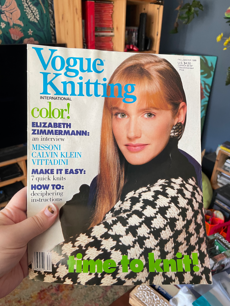
In my last post I described my plans for a sweater inspired by Harlequin costumes and Venice, and how I finally found the perfect pattern in a 37-year-old issue of Vogue Knitting.
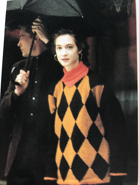
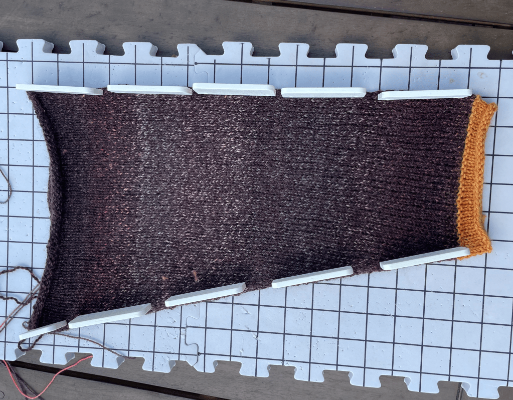
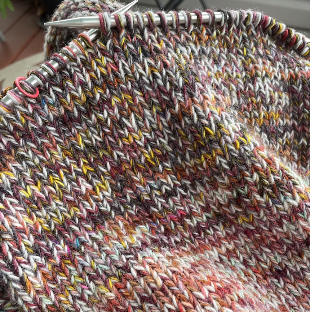
The pattern is #2 Harlequin Pullover by Anne Mieke Louwerens. I got started by pulling out literally every partial and single skein of DK yarn I had, determined to absolutely decimate my stash. I also frogged a sweater that didn’t end up fitting how I wanted, and used the yarn from that – Stipple DK from Yarn Hero in the colorway Dagger – as my main color.
This yarn is so pretty–and discontinued, which I only noticed last night when I had a sudden feeling that I would need more to finish. Whoops. I might be playing yarn chicken with this project, especially since I added two repeats of the diamond motif to make the sweater bigger. Published in an era before knitters were grading size-inclusive designs, this sweater is “one-size-fits-all”* (*read: would definitely not fit me). I’ll manage though. I should definitely have enough for the front and the two sleeves, and I can live with a contrasting back if needed.
So far I’m most of the way through my front, which I’m also making a little longer with one additional row of diamonds, and finished one sleeve.
But it wouldn’t be honest of me if I didn’t reveal the shitshow underneath:
Yep. I’ve knit intarsia before, but this is by far the most complicated intarsia project I’ve done, with the most colors in play at once. The yarn management is unwieldy–if I want to get up from working on this, I either need to finish a row so that all the yarn is on one side of my body, or I have to slide out from under it to avoid mixing all the yarn balls together. It’s like a really bad seatbelt.
This project lives in the corner of the couch. A couch that belongs to my housemates, who I rent from, and their dog. If I work on this project every day, I can kind of justifying leaving it out, because putting it away means destroying the loose yarn ball organization system and having to spend a lot of time untangling when I want to bring it back out from the project bag.
Obviously this project can’t travel, and suddenly I’m commuting again. I recently started teaching for a local university’s college readiness program, and now I’m teaching writing and composition to high school seniors at two different schools. So I’m back on that city bus, traveling from one to the other, and I physically can’t ride public transport without a knitting or crochet project.
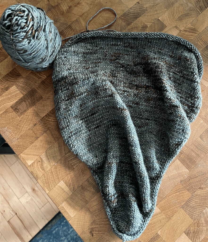
I’ve also been working on an improvised bandana for that cooler weather that’s supposed to be showing up soon. I’m using a lovely wool/cashmere blend, which I got from a yarn company that I will not name since they’ve since been exposed for toxic management. I had two balls of this, and used one to make a Wedding Necktie for my partner. Now I can match with my own neckwear.
So beautifully mindless that it’s impossible for to lose my place when going over a pothole. I decided to use an i-cord edge, but now I’m worried that it’s too tight and causing it to curl in too much. I’ll see how it looks after blocking–if that can’t fix the tension, I’ll redo it.
And that’s everything on the needles this WIP Wednesday. See you next time.
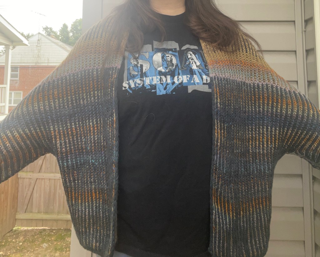
I’m really on a cardigan kick! The ones that I’ve made in the past have become too small for me, with the exception of my Felix Cardigan, which is an excellent staple piece that pretty much goes with anything. But lately I’ve been wanting showstoppers and statement-makers, especially when they can eat up as much of my stash as possible. A two-color brioche design like the Oliveros is ideal for this.
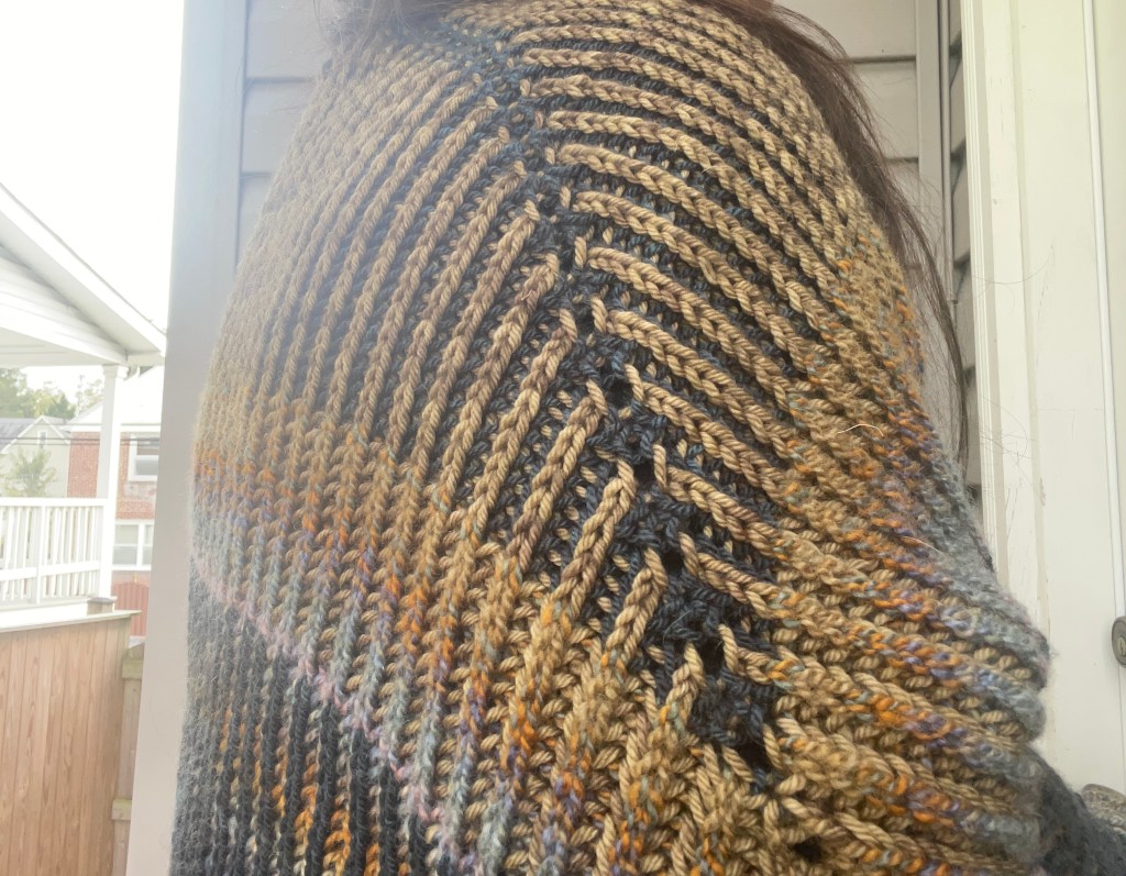
Brioche is an intimidating technique to learn, and fairly time-intensive (you basically work every row/round twice), but it creates one of the most relaxed fabrics in knitting. Cleo Malone, the designer, embraces that with a construction mostly unfettered by anything that constricts the stitches too much. No picking-up of stitches, no seaming. While well-designed, there’s very little structure. The whole sweater grows like organic matter from a central point at the back of the neck and over the shoulders, stretching with the body to let those flashes of contrast color shine through.
Of course, the relaxed nature of this pattern means it will grow significantly during blocking, which is what happened to me. The sleeves are actually quite a few inches past my wrist (and my fingertips). That’s okay with me, though, I’ll just cuff the sleeves. But if you want something more to your measurements, block with caution.
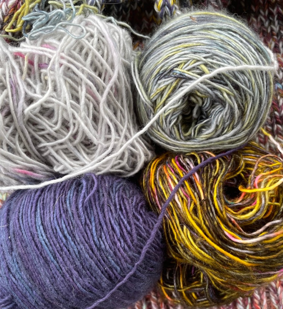
There’s a distinct cloak-iness to this pattern, so I decided to go full fantasy with the color choices. Blue and gold has always reminded me of magic and wizards, so from my stash I chose a deep navy/teal mystery yarn that I had left over from a sweater I made for my dad, “Willow” from Yarn Nouveau (an antique gold shade), and “Tectonic” from Feederbrook Farm, a prismatic marl with gold, blue, orange, and periwinkle. I have a whole Pinterest board of wizardy visuals, and I’m a sucker for the celestial aesthetic.
What I’m listening to
The wizardly inspiration isn’t surprising when I’ve been hosing down episodes of “The Wizard, the Witch, and the Wild One” from Worlds Beyond Number, a D&D actual play podcast with some giants of the TTRPG world: Aabria Iyengar, Lou Wilson, Erika Ishii, and Brennan Lee Mulligan. Iyengar plays the Wizard Sky (Suvi to her friends – the naming conventions of wizards is a whole thing in this universe), a magical prodigy balancing her duty to the institution that raised her with the outsider perspectives of her close companions: Ame, a rural-dwelling witch whose power comes from communion with nature and spirits (Ishii); and Eursulon, a spirit who has become stranded in the mortal plane where he is at risk of persecution (Wilson).
Iyengar and Mulligan, the dungeon master who runs this campaign, have created a very different vision of wizards than I’m used to. In table-top games, wizards can cast powerful spells and learn many different kinds of magic, but are known for being “squishy”, or easy to physically harm. The image of an old bearded sage in a tall brimmed hat persists.
Not here. Suvi is a young Black woman with a hot boyfriend and a caffeine addiction. Her adoptive mother figure is a sword-wielding valkyrie of a mage. The Citadel where they live is both an academic and military headquarters. There are spells that become people – a personified mage hand cantrip works as a baker and makes Suvi’s favorite sandwich. Wizards can donate their unused spell slots to other wizards who might need them more. They can imbue physical objects, including weapons, with spells. In “WWWO”, what is possible when magic can reshape reality is truly and thoroughly explored. Why couldn’t a wizard be anything, really?
It’s actually a little terrifying. I’m not very far into the campaign, but I’m waiting for the shoe – the shoe being that the Imperium and the Citadel are unsustainably powerful and, for all their wonder, must be dismantled before it embroils the world in unending war – drops. Highly recommend.
Well, my quest to reduce my stash continues as I’ve begun AquaMarline by Park Williams. I recently finished two cardigans (I’ll cover those in a FO Friday post) and I was itching to start something new, mainly because I will be traveling soon and I wanted to have a project in-progress for the planes, trains, and automobiles.
Four of the many colors that will comprise the sweater. Clockwise from bottom left: Hamilton, David Hess, and Block Party in Rustic Fingering from Neighborhood Fiber Co, and a Skinny Single from Hedgehog Fibres (lost the label so I’m not sure of the color name!)
Is a bulky sweater knit primarily from four strands of single-ply fingering the most practical choice for a travel project? No, but I’ve been on a large project kick for a while, so I stuffed the project and all four yarn balls into my backpack and moved a pair of shoes into my partner’s luggage.
I didn’t notice until I went to cast on that AquaMarline is a raglan knit from the bottom up. And it wasn’t until I was nearly done with the torso that I thought that might interrupt the marling gradient; I didn’t want the sleeves, knit separately and then attached to the body, to have a completely different color scheme and then have a noticeable border when they joined. So instead of starting the sleeves from the cuff, I started them from the other end. I did a crochet cast-on for the number of stitches needed for the widest part of the sleeve, and knit a couple of rounds in the same colors used in the torso. Then I attached the sleeves, and when I finish the body, I’ll return and knit the sleeves down to the cuffs. A crochet cast-on, like a provisional cast-on, will let me pick up live stitches when I’m ready.
The torso of my Aquamarline with the beginnings of the sleeves attached.
I think this pattern would offer much smoother color distribution if it was designed to be top-down rather than bottom-up, but as the design description says, this pattern is all about playing with color and experimenting. Maybe I’m just a little too much of a control freak to allow for some heavily randomized color schemes.
Where I’m traveling
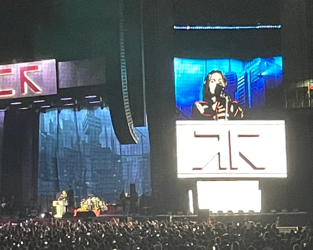
I brought my Aquamarline with me on the Amtrak to Philadelphia, where I saw one of my very favorite bands at Citizen’s Bank Arena. Yes, after 20 years of trying to see them live, I finally saw My Chemical Romance in concert. Truly, truly a dream come true for me. In the days since I’ve been relishing the feeling of being 13 years old again listening to Three Cheers for Sweet Revenge. It’s such a deep nostalgia for not just a time in my life, but for the imagination my preteen self had and how this particular band helped me indulge it.
This MCR tour is all about The Black Parade, which is the album that broke them into the mainstream. The first act of their performance, or pageant, really was the entirety of the album. The band dressed in their marching-band outfits and acted as the entertainment for a dictator of a fictional nation called Draag. During the set there was a firing squad, an appearance by the Philly Phanatic, Variety Puzzles, a launch of a nuclear warhead, a murder by a clown, a burlesque performance by the clown, and a suicide bombing by the clown. If MCR is good at anything, they are experts at theatrics.
Their second set was very stripped back. After Gerard Way, the lead singer, had his throat slashed and the rest of the members were taken off the stage with bags on their heads by Draag’s secret police, they reappeared on a second stage in the middle of the crowd and played a selection from their other albums. I don’t think there was a single person in the audience who didn’t know the words to every song, in either set. Here’s my selection of bad photos – I wish I had more but my phone battery was at 20% by the time they took the stage.
The Variety Puzzle bit was very exciting for me. I love Variety Puzzles.
The next day my partner and I spent the day wandering Philadelphia. After checking out of the hotel, we found a very high-quality cafe, Thank You Thank You, offering lots of different roasts that my partner has been wanting to try – he’s a huge coffee enthusiast – and had a couple of pourovers. Then i foudn the nearest yarn store, which was Yarnphoria just south of Center City. This is a lovely spot with cool, contemporary samples, displays of crocheted amigurumi, and the cutest little shop dog there ever was: Gertie.
Gertie ❤
When we walked in there were already some customers there who looked very much like they had also been to the concert the night before, so I felt very at home. The owner (or who I assume was the owner) was extremely welcoming and helpful, pointing out all the local brands they had available. I left with two skeins of Scout from Kelbourne Woolens, which is also a local Philadelphia business. At one point, Gertie got up from her couch, barked, and individually sniffed every person in the store. Definitely worth a visit if you’re ever in town. I would have loved to visit Wild Hand as well, but unfortunately we didn’t have time that day to travel to the Mt. Airy neighborhood from downtown.
And in just under a week, I’ll be leaving town again for Venice! My partner, who works in the film industry as an AC (assistant camera), worked on the documentary Cover Up about the career of Seymour Hersh. The documentary is from Laura Poitras and Mark Obenhaus (Citizenfour), and it was accepted to premier at the Venice Film Festival. This documentary is probably my partner’s favorite of the work he’s done, as he’s an ardent follower of politics and history, so it was beyond exciting for him that he was invited to attend the premiere. And I’m even luckier that I get to join him!
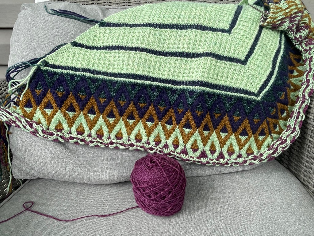
This WIP Wednesday I’m happy to share a project I’ve been hoping to start for a loooooong time: the Artus Shawl by Natasja Hornby. What was stopping me? Well, despite the unforgiveable size of my stash, I could not pull together 5 different colors of sport-weight yarn.
I love the challenge of a wider color palette, which I consider to be 5 colors or more. I’ve been using Pinterest a lot lately and started a board just for aesthetic photos that contain intriguing color combos, and an interesting trend emerged: I’m really into purple and green right now. Not to be all Joker-y about it though.
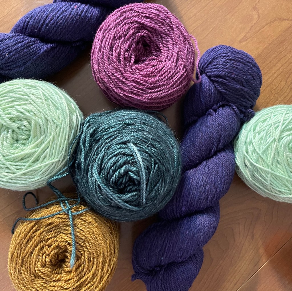
Golds and oranges have also been popping out to me, and I like the contrast of earthy ochres in rock formations and tree bark and more mystical, mermaidy shades that appear in luna moths (and Cape May Fiber had a Luna Moth colorway!), seashells, and tilework. So when I attended the Frederick Fiber Festival and Maryland Sheep and Wool, I went with a mission to find some of these particular shades. I got nearly everything from these trips, and then rounded our my palette with a purchase from Brooklyn Tweed. BT has recently stopped producing their own yarn (but will still be publishing patterns), and they were running a clearance sale. Their beautiful inky blue-violet color “Tapestry”. was a perfect fit, and I ended up getting enough skeins for this shawl and a future sweater.
The Artus palette: Tapestry (deep purple) in Imbue Sport by Brooklyn Tweed, Luna Moth (light green) in Merino Cashmere Silk Sport, Ochre (gold) and Aubergine in Making Tracks Lite by Junction Fiber Mill, and a mystery stash yarn in a deep blue-green.
Now that I’ve cast on I’m locked the fuck in on this shawl. I’m extremely engaged. There are three small sections of stranded colorwork at the top of the pattern that I was kind of dreading (I’m not great at stranded, and even worse at it on the wrong side)n and Hornsby made these sections mercifully short – my finger joints thank her. I’m now in the mosaic sections, at the trim of the shawl, where I’m only handling one color of yarn at once. Because mosaic stitches tend to be more tense than stitches worked with no slips, there’s a risk that the long side of the shawl will bend downward instead of maintaining a triangle with straight, defined lines. To avoid this, I’m stretching the slipped stitches in the mosaic charts to the absolute maximum to.keep a similar gauge to the stitches in the waffle stitch section. And I think it’s working! I won’t be able to tell until it’s completely off the needles and blocked, but I’m feeling optimistic.
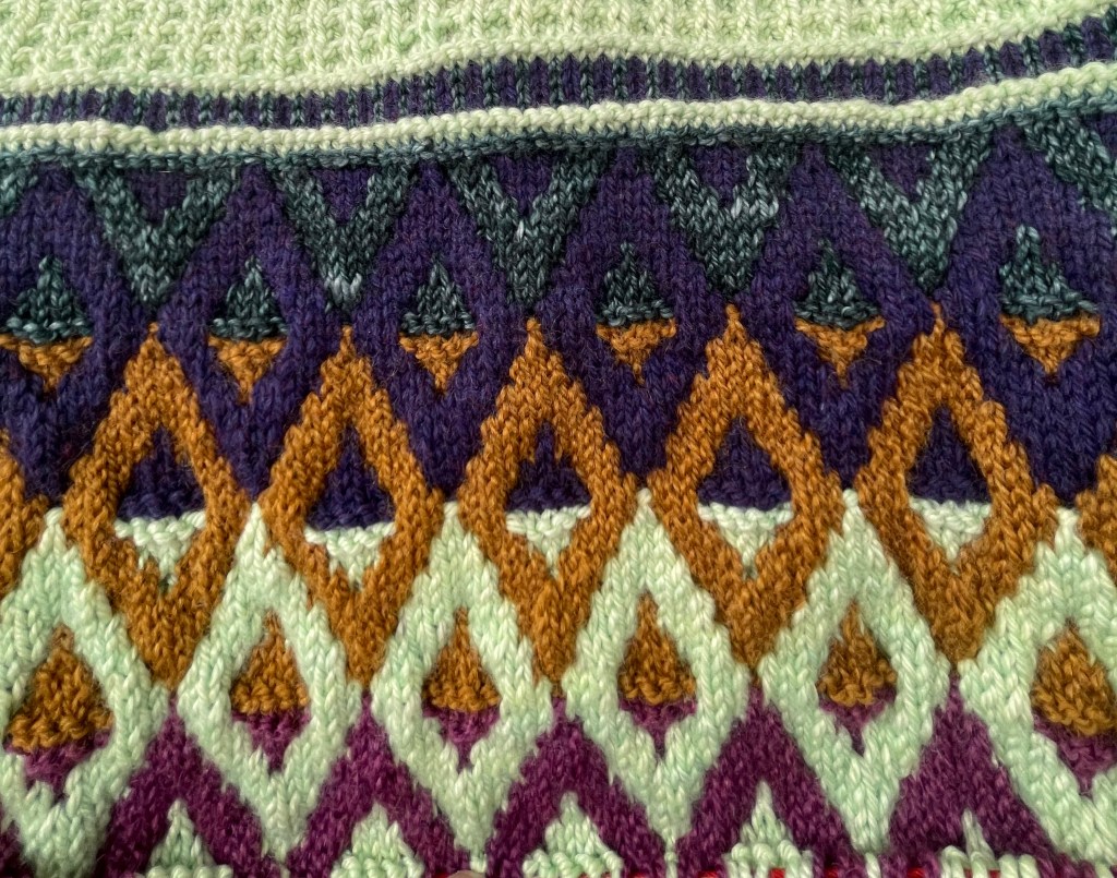
Now that all five colors have been worked into the project, I’m excited to share a photo that really shows how the palette works.
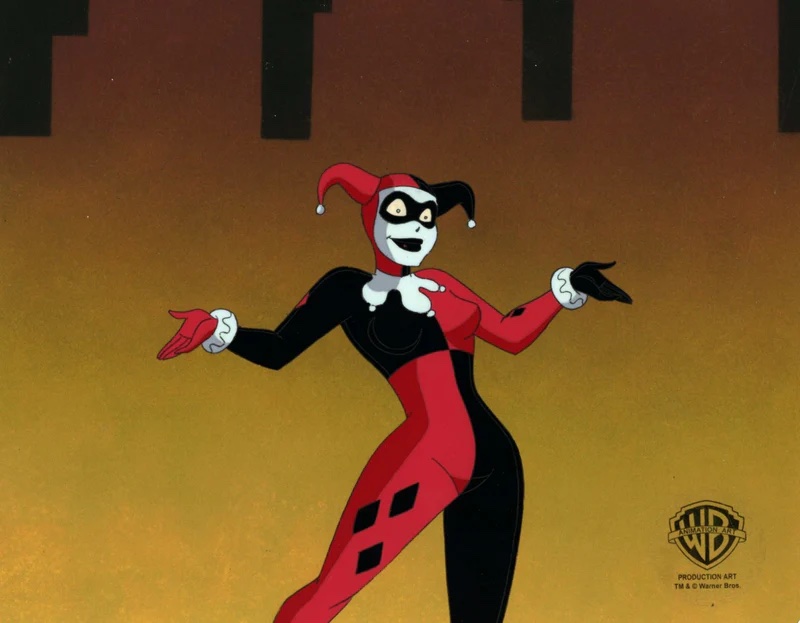
You know, now that I look at this diamond motif, it vaguely reminds me of someone…
Lol whoops
What I’m Listening to
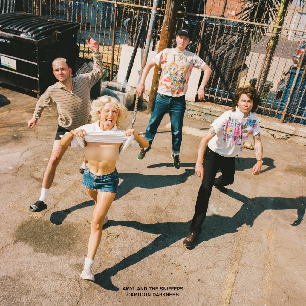
I got to see one of my favorite bands last week, Amyl and the Sniffers. They’re an Australian punk/pub rock band whose latest album has a little bit of glam, although they haven’t lost a speck of their edge; their single “Jerkin’” is about as catchy and contemptuous as can be imagined. But among their harder, nastier songs like “GFY”, they have plenty of tracks that are deeply heartfelt and earnest, like “Knifey”, which is dedicated to victims of femicide, and “Big Dreams”, which offer words of encouragement to anyone struggling to figure out their life’s trajectory. That sincerity feels like a binding element of the band, judging by the ease of their on-stage banter with each other (which includes some great, groan-worthy dad jokes). Amyl and the Sniffers offers a truly electric live performance, and I can’t wait for their return to the US.
The cover of Amyl and the Sniffers’ newest album, Cartoon Darkness
New-to-me dyers, a hyper-specific color mission, and the importance of showing up in the rain
I had been wanting to go to the Frederick Fiber Festival for years and never had a chance because until recently, I had always been working on Saturdays. Tough, especially because FFF happens twice a year – twice as many chances for me to get my ass there!
During my tenure at the yarn company, we typically went to the big events, like Rhinebeck, Stitches (before it imploded), and VKL (before the thought of unloading a truck in the middle of Times Square became enough to give one hives). I developed a preference for the farm-ier, more outdoorsy events, where in addition to indie dyers and designer appearances, there were also farmers auctioning sheep and herding dog demonstrations. FFF isn’t quite large enough for the complete county fair vibe (I’ll get my fill of that when I make another small roadtrip to Maryland Sheep & Wool next weekend), but it introduced me to a number of vendors I hadn’t had the pleasure of shopping with before.
Before I went absolutely apeshit at every shiny new booth, I had to remind myself that I had a mission. I’ve been wanting to make an Artus Shawl ever since it came out, and I have a very specific color scheme in mind that revolves around luna moth green. My partner, who loves solving problems, was with me, so I asked him to keep an eye out for a similar shade. I was fully expecting not to find it that day, but I happened to find it at Cape May Fibers. I held up a skein of mohair and said “Look for this, but not fuzzy”; I put the skein back down but my partner had the good sense to take a picture of the label to get the colorway, and wouldn’t you know it, the color was called “Luna Moth”. So while I couldn’t get the weight I needed at the festival, I placed an order in sport weight that night.
I also made a stop at Yarn Hero’s booth, another source for color-shifting fractal-spun yarn. What I really appreciated here was that in addition to their beautiful standard skeins, Yarn Hero had flawed skeins, mill ends, and test runs for sale, sold by the gram. Not only is it a more affordable option for festival-goers, but I find this also speaks to the sustainability of the company. It’s good to see businesses not hiding away skeins that are short or have slubs just because they can’t sell them full-price. And it’s a rare opportunity for people like me who aren’t picky about a little mill knot here and there, or for folks who don’t want to buy more yarn than they actually need for a project.
This is another perk of going to festivals like these: you get to see products that often don’t make it to the business’ websites. Plus you get to actually meet the people who run the companies, see the colorways in person, and feel the yarns. This is especially important for companies that don’t have a retail space, and rely on trade shows and trunk shows to directly sell. These events are usually the biggest money-makers, and will often keep an indie dyer in business for months.
Which is why it’s so crucial, if you’re able, to brave the rain if the forecast calls for it. It never quite stormed on Saturday, but we had a clap of thunder and the rain was off and on, like someone was turned on the spigot every ten minutes or so while the clouds blew through. Almost all of FFF’s booths, minus a few trucks and food vendors, were indoors and sheltered, but there was still a strong gust that blew through one of the buildings and threatened some stands. In those moments, everyone comes together to brace against the poles and pick up flying shawl samples.
At many festivals, however, booth spaces are in outdoor tents more exposed to the elements and mud, and some unluckily-placed vendor gets the short end of the stick when the weather turns sour. Rain or shine, these events are planned well in advance and can’t be canceled.
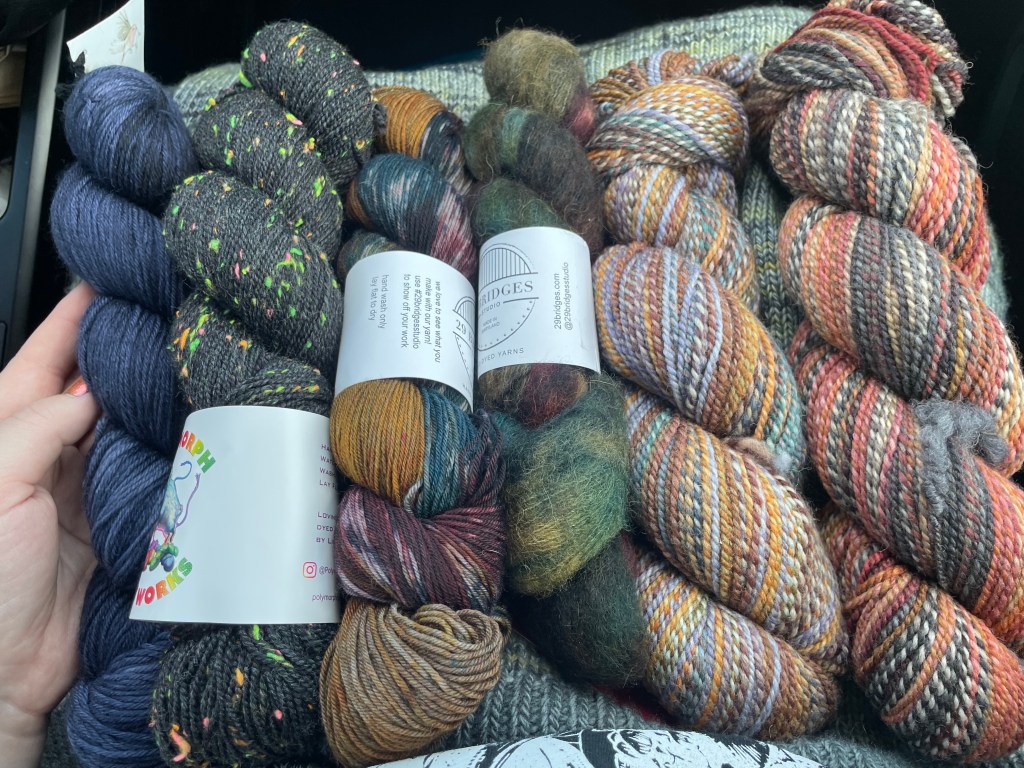
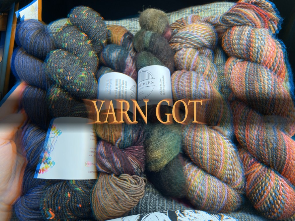
Eventually the sun came out, and we called it a day at the Frederick Fairgrounds with my new skeins. The yarn I got from Polymorph Dye Works is especially fun, black with neon neps – it reminds me (in the best way) of 90s arcade carpet.
My little hoard from FFF, from (left to right) Robin’s Promise Yarn Co., Polymorph Dye Works, 29 Bridges Studio, and Yarn HeroThe same image just styled like a Dark Souls achievement
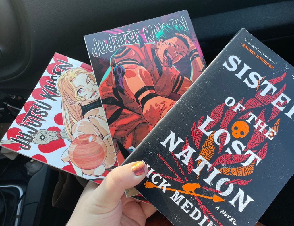
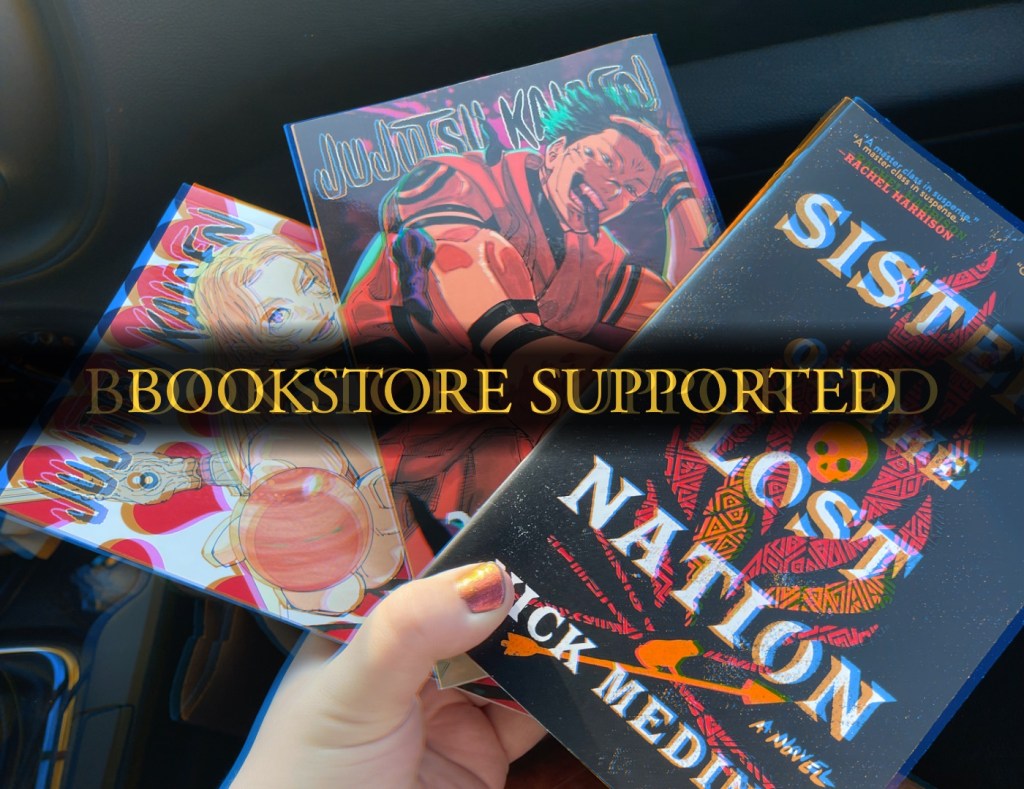
But Frederick is a beautiful little city, so our day didn’t end just yet. My partner is a massive coffee-lover, and we made a stop at Gravel & Grind, a cafe and bike repair shop that sells great drinks and independently roasted beans. It was also Indie Bookstore Day, so while we drank our coffees we looked up the nearest bookshop to support. That turned out to be Curious Iguana on Market Street, downtown Frederick’s main drag of boutique storefronts and restaurants. I picked up volumes 23 and 25 of Jujutsu Kaisen, which were missing from my collection, as well as Sisters of the Lost Nation by Nick Medina; I had read Indian Burial Ground and I’m looking forward to reading his first novel.
My haul of books from Curious IguanaThe same image but styled like an Elden Ring achievement
Our last stop of the day was Gwenie’s, a Filipino bakery with a couple locations in the MD/DC metro area. We were introduced to Gwenie’s by a friend of ours, and they requested a slice of ube cheesecake if we were going to be in the area. We got there within an hour of their closing time, when everything is 30% off, so we left with an armful of of mamons and sylvanas.
An ube mamon and ube custard cake, you guessed it, styled like a Dark Souls achievement.
Driving home from a lovely day out, I think the highlight of my Frederick visit was running into a regular customer from my former job and exchanging excited greetings. At least now they know I didn’t just fall off the face of the planet when I quit. Closure!
*I’ve never played a Souls game, Sekiro, Bloodbourne, Elden Ring, or even a Souls-like. I just think the title cards are funny.
A deeper dive into color politics, philosophy, and art criticism.
In my first color post I wrote about the tension between beauty and color, and all its associations. Sometimes in the pursuit of a pleasant palette, it’s not just “ugly” colors that get rejected, but any colors with negative, disturbing, or gross connotations. Occasionally this results in the rejection of color completely.
I needed some wiser insight, so now I’m reading Chromophobia by artist David Batchelor. Batchelor explores how Western perception and use of color is tinted (pun intended) by fear and domination, stemming from Western philosophers’ and critics’ colonialist, racist, and misogynist associations with color. From ancient Greece to modern misconstructions of minimalism, Batchelor points out how color is simultaneously revulsed and seducing, and in order to achieve a Platonic ideal of art and the body, color must be carefully controlled. Color is relegated to the cosmetic and vulgar, so its careful use or disuse becomes a class signifier of moral superiority.
From Architectural Digest, a room in the home once shared by Kim Kardashian and Kanye West
But Batchelor points out many times how these chromophobes contradict themselves, downplaying color as secondary and minor, and yet essential to arts like painting. Scholars will completely disregard an artwork’s use of color to analyze its form and composition in a sort of “negative hallucination”, a term Batchelor borrows from psychology, even though color is one of the first things our eyes perceive. Color is seen as a distraction, something that covers up form that is perceived as truth.
Which is why chromophobes were shaken when historical and chemical research showed that classical statues from Greece and Rome, the origin point for that white platonic ideal, were not originally pure white stone, but colorfully painted. And racists were invested in the belief that these statues were white because pigment meant acknowledging that some Greeks and Romans had melanin. This article from The New Yorker (which also cites Batchelor) explores of the public’s reaction to these painted statues, and how contemporary racism tries to warp history to its benefit, to the myth of the “great western civilization” completed separated and above the rest of the world.
Experimental color reconstruction of a bronze statue, from the Gods in Color exhibition
The fact that the ancient world was happily polychrome subverts the form-first philosophy, which also subverts who has been excluded from the canon by chromophobia. By disqualifying the use of color as a true artistic expression, a person can also disqualify any cultural or artistic importance placed on color, which for the chromophobic, is a great way to discredit women’s art as “decorative” and therefore unserious, and non-white people’s art as unintellectual.
Women in western culture, in my experience as a womanish person in western culture, are charged with being beautiful and then condemned as vain and superficial. They are associated with the colors of cosmetics, which as Batchelor discusses, are condemned as deceptive. We’ve been charged with making the home beautiful because no one wants to live in a colorless shoebox, and then the “domestic arts” are called “crafts” and then undervalued. The Bauhaus school, which while progressive for its time, split itself by gender by capping women’s admission and attempting to shoehorn them into the “feminized” subject of weaving, the only department led by a woman, Gunta Stölzl, who was significantly underpaid.
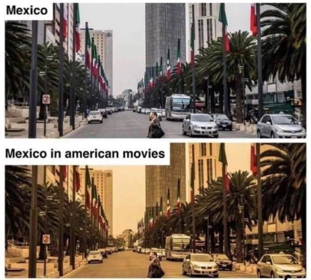
The addition of color is even used to signify exotic locales and then subliminally deprecate them. I can’t think of a better example than the “Mexican filter”, a notorious phenomenon in color grading that renders non-Western settings in a yellow haze. Maybe this yellow tint was meant to evoke heat and sun, but as we all know, the world does not get visually yellower with heat. For a culture that associates whiteness with clarity and goodness, critics have pointed out that the sepia filter implies grime and toxicity. And it’s not exclusive to depictions of Mexico either.
The Mexican filter is much-memed.
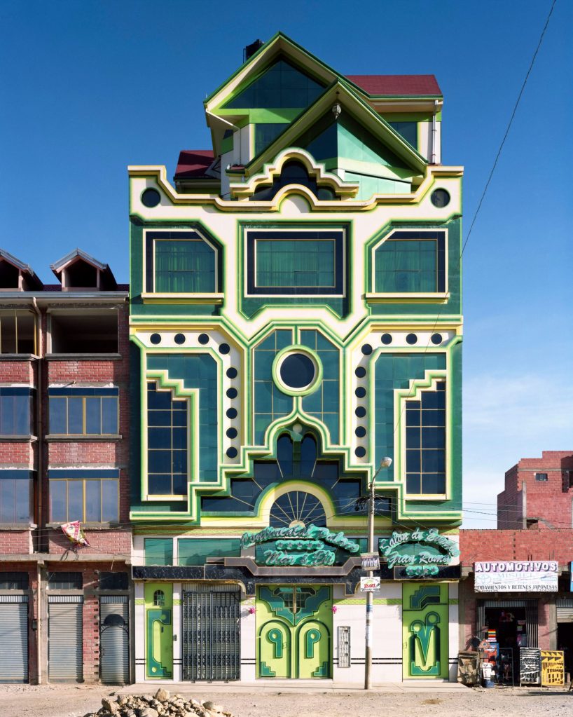
If you’re looking for the antidote for western chromophobia, I’ll point you to the work of architect Freddy Mamani, who has spearheaded the New Andean style in El Alto, Bolivia. Mamani is Aymara, along with about 75% of El Alto’s population. He incorporates motifs and imagery from centuries-old pre-Columbian structures (he specifically talks about the city of Tiwanaku) and also the vivid color schemes used by Aymara weavers. These buildings, called cholets, combine sharp geometric patterns with curving botanical lines, and stand out against most of El Alto’s red-brick buildings.
One of Mamani’s cholets.
One of the most striking things about Mamani’s vision is his use of color in pursuit of modernity. Many of critics and aesthetes quoted by Batchelor think of color, either positively or pejoratively, as belonging the realm of the primordial and pre-linguistic. That purest color both exceeds and predates our use of language, and is associated with genesis – but isn’t that infantilizing? In El Alto, the cholets’ colors are the articulation of Aymara presence and influence. It’s a visual declaration that indigenous people are not relegated to history, have not been wiped out by colonialism, and thrive.
David Batchelor in 2019, standing in front of some of his works at his studio. From the Ingleby GalleryFreddy Mamani sitting on the stairs inside one of the Cholets. From an interview with SixtySix
But context is everything when it comes to color. This round-up of photographs shows opaque couché in a wide variety of beautiful manifestations – from foliage to sky, smoke and streetlamps. It has a warm, golden tone that feels firelit and mysterious. Even ancient.
Cave painting from Lascaux, France. Opaque couché appears in the main of the largest horse, the bodies of the smaller animals, and the patina around the edges.
While I worked in a yarn store, I heard a lot of people’s ideas about colors and what they mean. What colors are happy, what colors are age-appropriate? Color seasons were frequently discussed, and I always had trouble answering when asked if a color matched someone’s skin tone. Who am I to say what looks good with someone’s skin, especially if the color brings them joy, and especially when people with darker skin tones have historically been discouraged from wearing certain colors? I am a white person who has never been othered by my complexion.
My very least favorite customer interaction at the yarn store went like this:
The customer was looking for yarn for a sweater she planned to work on and wear during a trip to Europe and asked for my help. We picked out two colors, one of which I loved, but I admit is challenging. I had used it myself in a sweater project and was so excited that another person liked it. It was a speckly mix of light gray, gunmetal, neon yellow-green, and loam brown. Challenging, right, but interesting. She left happy and excited for this project. But she called the next day asking if she could return the yarn. Why? She said her husband didn’t like the color.
There was a lot of this: the idea of what will be the most beautiful. Most beautiful to the people who will see it, most beautiful in the landscape of the existing wardrobe. But beautiful didn’t mean beautiful, it meant easy and non-confrontational. This understanding of beauty is alienating to me. But if I grate so much against beauty, then why am I so afraid to be ugly?
I don’t want to define beauty as the things that are easy to look at, or necessarily attractive. I want to define beautiful here in this blog post as interesting, and that includes things that are ugly and disturbing.
So let’s look at some colors and find interesting, ugly, and disturbing ways to look at them.
Like many knitters, crocheters, artists, crafters, I love looking to natural phenomenon for inspiration. Like bruises.
This is a stock image, but it does remind me a lot of a bruise I got on my thigh when I got tipped out of a kayak trying to come ashore.
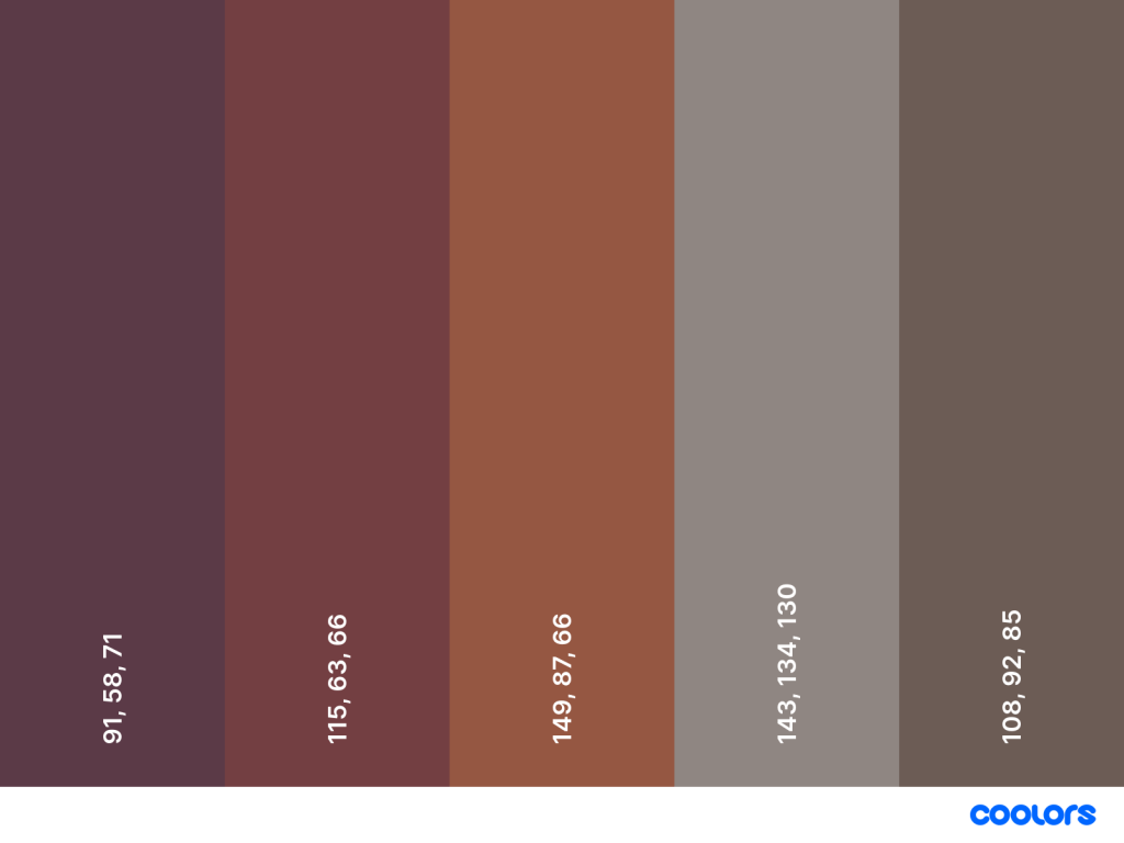
Gross, right? Painful-looking? Sure, but the colors are spectacular. I’ve recently realized that many of my favorite colors -berry red, warm purple, olive green, and opaque couché – all appear in bruises.
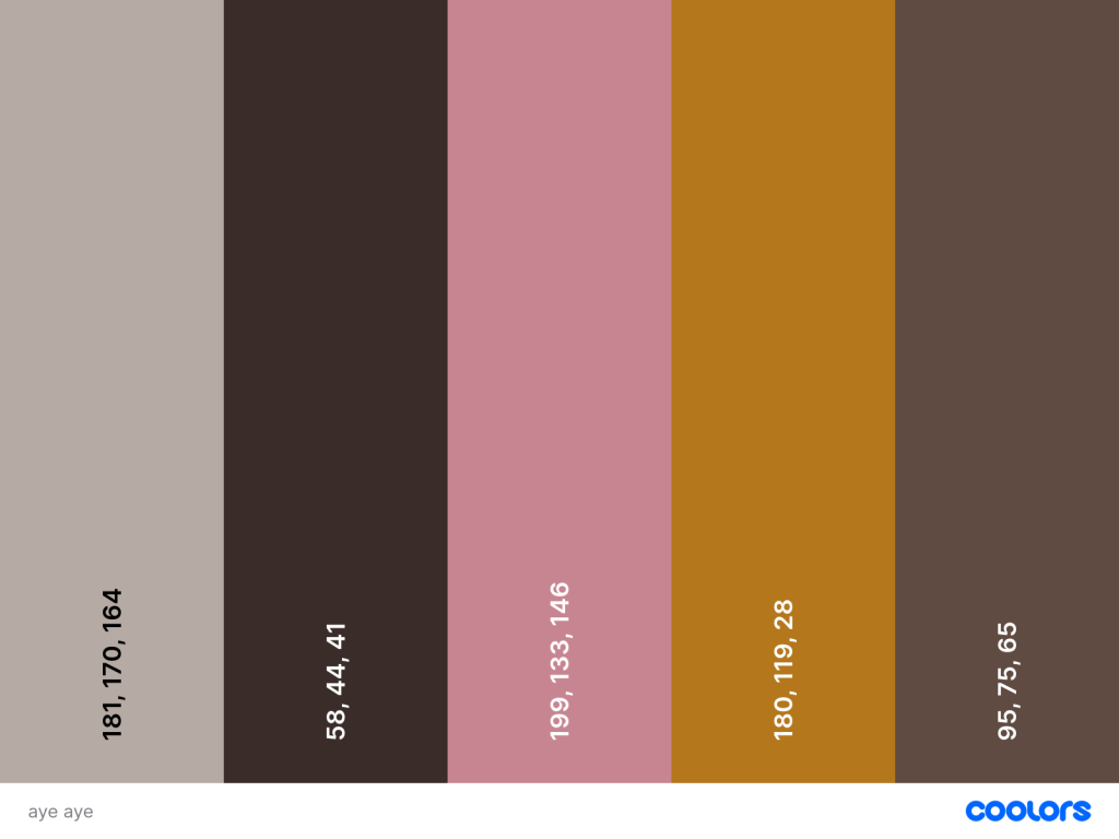
Let’s look away from brightness and saturation. Isn’t nature full of animals that survive by camouflaging into leaf litter, soil, and darkness? I know I’ve sold the calm, neutral palette of the aye-aye in yarn to at least one customer. And look at that bright pop of amber in its eyes!
Aye-ayes are from Madagascar.
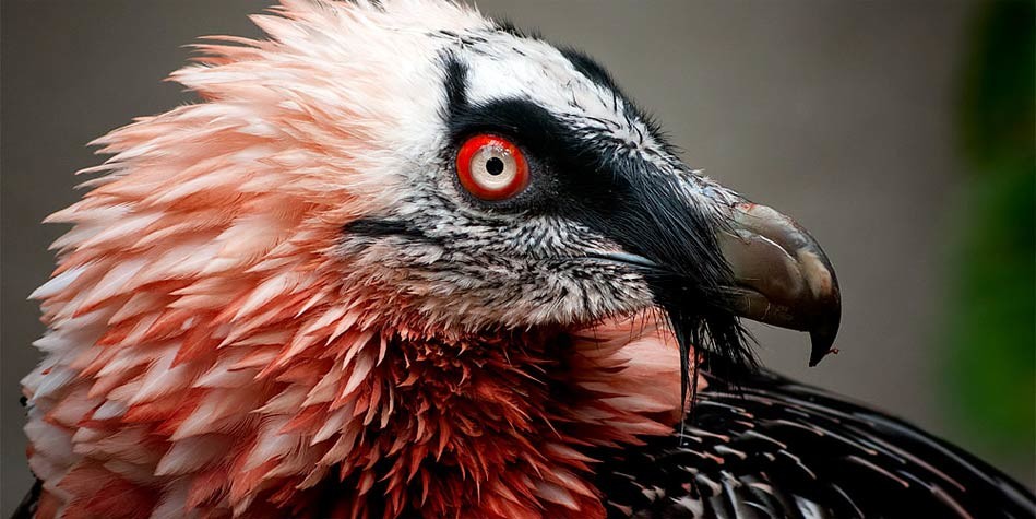
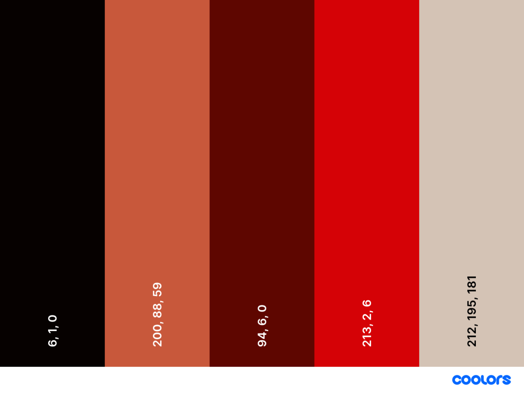
I’m getting a little biased toward earth tones, so let’s go back to something more vivid for inspiration. Like the bearded vulture.
Check out at those striking red eyes and feminine, peachy-pink feathers! These carrion birds eat everything, including the bones. We stan a sustainable queen.
But these are all examples of me finding some beauty in conventionally ugly vessels, so let’s find some ugly in a conventionally pleasant vessel. Like my neighborhood on this very sunny, mild spring afternoon. What do I get when I pick out some colors from this photo?
Please don’t try and deduce where I live.
To keep it fair, I only picked colors out of this photo from organic matter – I left out any human-made objects. I also tried not to replicate shades of the same color. From right to left, I picked some periwinkle flowers growing on the lawn, the bark of a magnolia tree, a forsythia bush down the block, the grass, and the sky.
And this is a challenging palette for me. Everything feels very weak. The blue and purple are too cool to harmonize with the yellow and green, and maybe this purple and blue are too similar to be distinguishable. The tree trunk is undefinable as a shade. Is it brown or gray? What color are trees, even?
I feel the urge to adjust some of these colors. Maybe the three in the middle need to be pushed cooler to create a pastel palette. Maybe the two on the ends and the tree need to be more saturated and warm to get something 70s-chic. Maybe everything just needs a good punching-up. I will try to resist that urge.
But it’s interesting that despite being given very real colors (albeit diminished by my phone camera, and diminished again by the display on your screen, and diminished again by being stripped of texture and depth by the handy color palette tool I used) I still feel like they could be tweaked. These weak colors are confronting me.
When I draw color inspiration for my knits, or if I were to try rendering something in paint, am I trying to correct them in real life? Would a painter disregard a subject because its disharmony would be mistaken for the artists’ inability to render harmonious color?
I can’t help but think of my partner, who sometimes does freelance color grading and correction for digital footage. He manipulates the color on screen, which is processed as data from a compressed linear format that appears flat and gray, to an end product that matches his client’s aesthetic goals. Sometimes that goal is more artistic, especially if he’s working on footage for a narrative film and there’s a genre-dictated mood to achieve; sometimes it’s corporate and the client wants something that feels bright and neutral; sometimes the goal is to recreate, as realistically as possible, what the people on set were seeing, even if my partner was never on set himself. Plus, even before he gets to color correction, the realism is tampered with on set. Things are lit in a certain temperature. Makeup, which is its own color and light correction, is applied to anyone in frame. The make and model of the camera and the settings on the monitors will all affect how the color is processed into data. There are so many thumbs on the scale.
Even the goal of realism isn’t really to be real – he told me about a time he was working on footage for a beauty product line whose branding was all about “natural beauty”, but he was told to reduce the overt redness in one model’s skin. That was too natural, apparently, to be beautiful. While red and pink are widely enjoyed as decontextualized colors, on skin they signify imperfection and blemish. Even infection and illness, even though these too, are natural occurrences.
And so it was at the yarn store. Not even just suggesting a color palette that was a little strange, but even mentioning unpleasant or indelicate personal associations was enough to turn people off a skein and stop asking for my help shopping. Someone would be holding a lovely pink yarn and I’d bite my tongue about how it reminded me of flayed muscle, because they were probably thinking about azaleas . I said once that a steely blue-gray reminded me of sharks and that was enough to shatter their dreams of chic, neutral baby blanket for a little boy. My coworkers were glad to come up with unhinged color schemes and inspirations but when it came to selling the yarn, it was rare that somebody could match our freak. So the same color combos kept walking out the door, and wilder, louder, uglier-but-more-interesting colors were neglected.
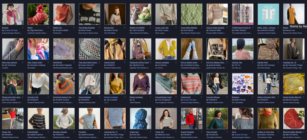
And maybe this was because I was working in the midst of a great beige trend in knitwear marketing. It’s understandable; beige, tan, taupe, sand, gray and white are neutrals and so the allow the actual design of the knitwear to be the first thing you see. They’re the lorem ipsum of colors.
The top page of Ravelry on April 7th, 2025. Almost half the featured designs are in a neutral sample, and some of them are right on the edge between color and neutrality.
And I’m not a neutral hater! I’m wearing black 95% of the time. There’s a long history of knits that are neutral by design, namely Aran sweaters and Shetland lacework that are traditionally made with undyed wool, and therefore show off extremely intricate details. Plus, we have the agency to knit these things in whatever colors we want. But what makes neutrals so safe is that they never feel like a mistake. They’re never challenging to the eye. Neutrals have been branded as “classy” and I…am not that.
So here’s my recommitment to getting ugly and garish. I’ll wear and knit with whatever gives me the most joy, especially if it washes me out or clashes with my undertone. I will cherish the colors that are most maligned and roll around in them like the little piglet I am. I will not be a spring, summer, autumn, or winter, but a horrible fifth thing. And I’ll wake up every day and think of how I can make this guy angry.


![[Ugly] Color Advocate](https://smittyisknitting.blog/wp-content/uploads/2025/03/pantone-opaque-couche-pantone-448-c-1.jpg?w=495)