A deeper dive into color politics, philosophy, and art criticism.
In my first color post I wrote about the tension between beauty and color, and all its associations. Sometimes in the pursuit of a pleasant palette, it’s not just “ugly” colors that get rejected, but any colors with negative, disturbing, or gross connotations. Occasionally this results in the rejection of color completely.
I needed some wiser insight, so now I’m reading Chromophobia by artist David Batchelor. Batchelor explores how Western perception and use of color is tinted (pun intended) by fear and domination, stemming from Western philosophers’ and critics’ colonialist, racist, and misogynist associations with color. From ancient Greece to modern misconstructions of minimalism, Batchelor points out how color is simultaneously revulsed and seducing, and in order to achieve a Platonic ideal of art and the body, color must be carefully controlled. Color is relegated to the cosmetic and vulgar, so its careful use or disuse becomes a class signifier of moral superiority.

But Batchelor points out many times how these chromophobes contradict themselves, downplaying color as secondary and minor, and yet essential to arts like painting. Scholars will completely disregard an artwork’s use of color to analyze its form and composition in a sort of “negative hallucination”, a term Batchelor borrows from psychology, even though color is one of the first things our eyes perceive. Color is seen as a distraction, something that covers up form that is perceived as truth.
Which is why chromophobes were shaken when historical and chemical research showed that classical statues from Greece and Rome, the origin point for that white platonic ideal, were not originally pure white stone, but colorfully painted. And racists were invested in the belief that these statues were white because pigment meant acknowledging that some Greeks and Romans had melanin. This article from The New Yorker (which also cites Batchelor) explores of the public’s reaction to these painted statues, and how contemporary racism tries to warp history to its benefit, to the myth of the “great western civilization” completed separated and above the rest of the world.

The fact that the ancient world was happily polychrome subverts the form-first philosophy, which also subverts who has been excluded from the canon by chromophobia. By disqualifying the use of color as a true artistic expression, a person can also disqualify any cultural or artistic importance placed on color, which for the chromophobic, is a great way to discredit women’s art as “decorative” and therefore unserious, and non-white people’s art as unintellectual.
Women in western culture, in my experience as a womanish person in western culture, are charged with being beautiful and then condemned as vain and superficial. They are associated with the colors of cosmetics, which as Batchelor discusses, are condemned as deceptive. We’ve been charged with making the home beautiful because no one wants to live in a colorless shoebox, and then the “domestic arts” are called “crafts” and then undervalued. The Bauhaus school, which while progressive for its time, split itself by gender by capping women’s admission and attempting to shoehorn them into the “feminized” subject of weaving, the only department led by a woman, Gunta Stölzl, who was significantly underpaid.
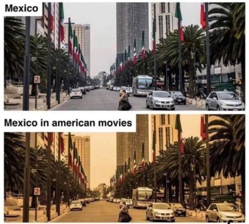
The addition of color is even used to signify exotic locales and then subliminally deprecate them. I can’t think of a better example than the “Mexican filter”, a notorious phenomenon in color grading that renders non-Western settings in a yellow haze. Maybe this yellow tint was meant to evoke heat and sun, but as we all know, the world does not get visually yellower with heat. For a culture that associates whiteness with clarity and goodness, critics have pointed out that the sepia filter implies grime and toxicity. And it’s not exclusive to depictions of Mexico either.
If you’re looking for the antidote for western chromophobia, I’ll point you to the work of architect Freddy Mamani, who has spearheaded the New Andean style in El Alto, Bolivia. Mamani is Aymara, along with about 75% of El Alto’s population. He incorporates motifs and imagery from centuries-old pre-Columbian structures (he specifically talks about the city of Tiwanaku) and also the vivid color schemes used by Aymara weavers. These buildings, called cholets, combine sharp geometric patterns with curving botanical lines, and stand out against most of El Alto’s red-brick buildings.
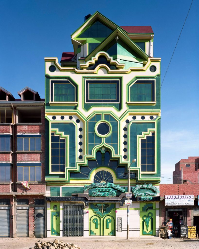
One of the most striking things about Mamani’s vision is his use of color in pursuit of modernity. Many of critics and aesthetes quoted by Batchelor think of color, either positively or pejoratively, as belonging the realm of the primordial and pre-linguistic. That purest color both exceeds and predates our use of language, and is associated with genesis – but isn’t that infantilizing? In El Alto, the cholets’ colors are the articulation of Aymara presence and influence. It’s a visual declaration that indigenous people are not relegated to history, have not been wiped out by colonialism, and thrive.